
Tana
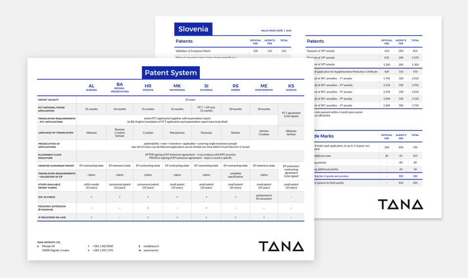
Tana is a regional leader in intellectual property protection. For the past 25 years, the company has been serving global clients with expertise in patents, trade marks, design, copyright and litigation across the SEE region. Filburg has been entrusted to make a complete overhaul of their visual identity and corresponding applications, from stationery to working documents to a brand new website.
CLIENT
Tana Patents Ltd
ASSOCIATES
Borealis (development)
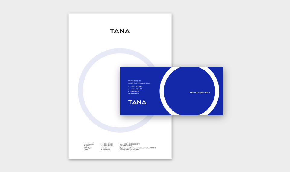
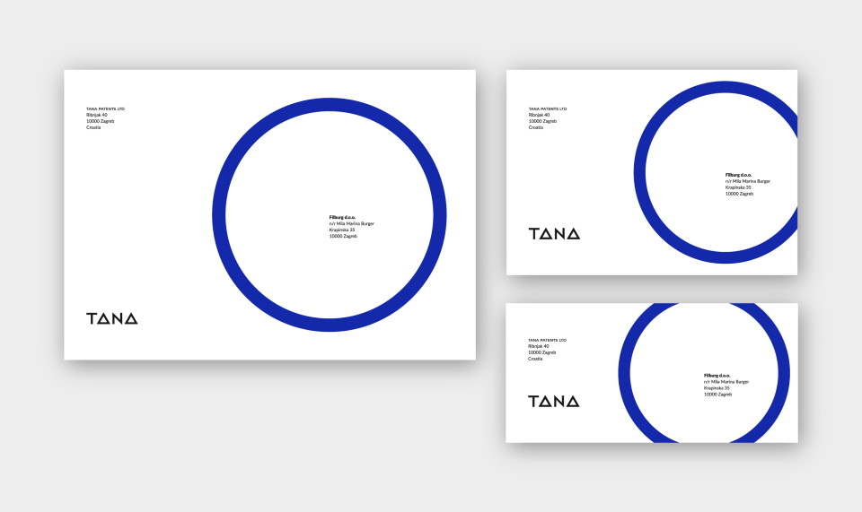
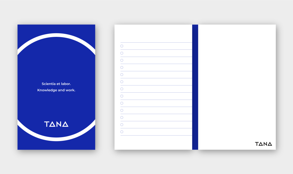
In its essence, Tana protects valuable ideas and processes which enable the progress of mankind. The circle symbolises protection – that’s why in the visual identity it’s used as a holding shape which can be flexibly enhanced with imagery corresponding to the context or communication. The colour set is an evolution of the previous one, ensuring certain continuity, but the new blue now reminds of International Klein Blue, a colour conceptually patented by Yves Klein.
The visual identity as well as all its applications communicate Tana’s understated expertise, trustworthy agility, and elegant modernism with traditional undertones. It’s based on a simple colour set and the circle as a protecting shape which becomes a major dynamic design element.
The new website, instead of using big words and gestures aims, through well balanced animations, transitions and clean layouts, to subtly communicate Tana’s values and approach. Ultimately, Tana makes life and business easier for their clients, and that’s where the website’s role comes into place.
- Visual identity
- Copywriting
- UX and UI design
- Visual communications

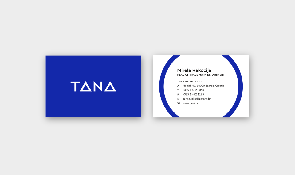
New logo, with geometric simplification of letters A communicates stability and agility at the same time, as well as a no-nonsense approach to business.

Related projects
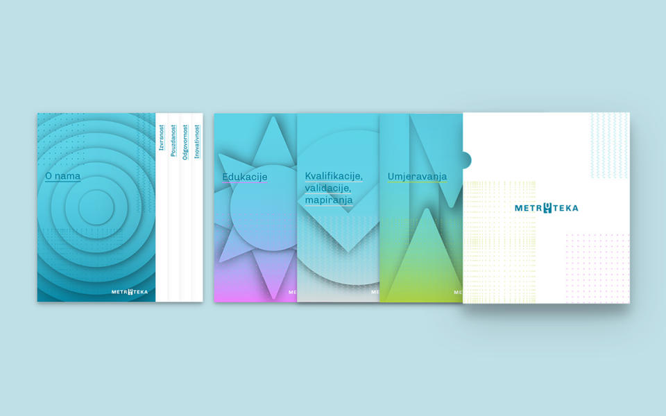
Metroteka
Branding and visual communications
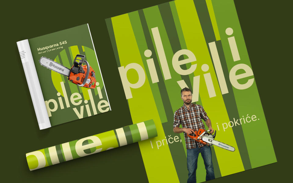
Pile i vile
Branding and visual communications

Trčaona
Branding, identity and campaign