Data storytelling
You’ve invested in research — now make it work harder. Turn rich insights into stories people understand, remember, and act on.
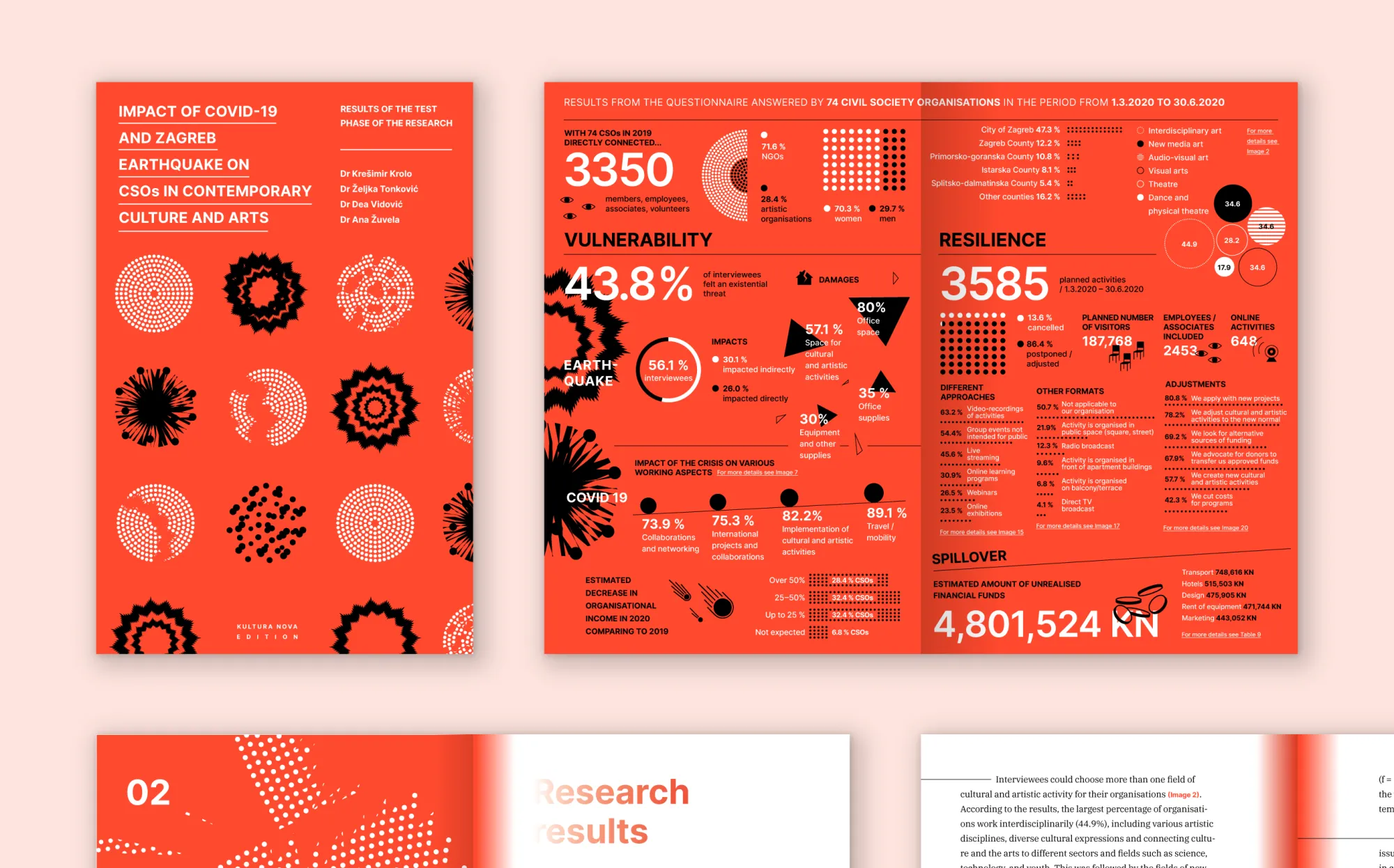
Case study
Visualizing the invisible – making cultural sector data speak
Since organisations and businesses went all in on digital, things are easier to calculate, track, analyze, and fix in almost real-time. Whether it's about presenting research results, visualization for academic purposes, financial reporting or marketing analytics, you need to go beyond the technical data, feature lists, and industry jargon to talk to your audiences.
Our approach

Making your audiences understand, care about and share your data starts with understanding the data, and the context, along with the outcomes you want. Once we have all that, we can formulate your objectives and structure the data for future use.
Objectives are then articulated into a narrative. Stories reinforced with facts make it easier to understand, and consider. Next, we tailor the presentation to your target audience communication preferences using HBDI® (Herrmann Brain Dominance Instrument) so we get a story which resonates with your audience. The presentation is then designed to match your visual identity, and make the data as clear and immersive as possible. Not just charts and tables, but maps and timelines, too.
To top it all off, we can turn it into a responsive web site, animated videographics, or a tablet app that you can share online or during conference presentations. Filburg also helps launch it to the world, boost engagement and promote it, be it a small printed publication or a multi-channel campaign.