Blok bar
Project info
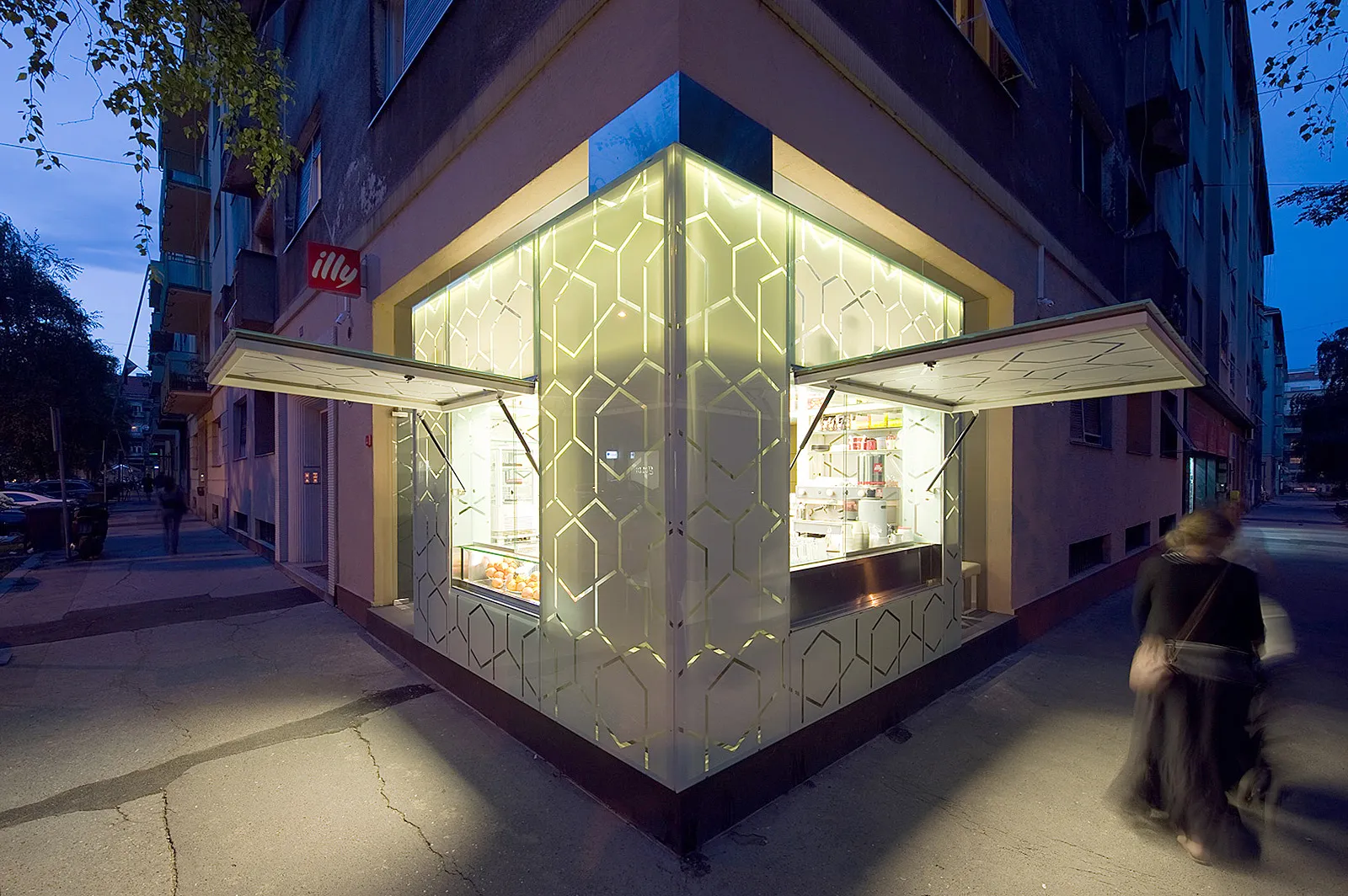

Starting from an unusual, blind street corner in a somewhat dormant block within the city center, we were approached to help reinvent the location through a holistic design intervention.
Through close cooperation with the celebrated Croatian studio Penezić & Rogina, architects, we were in an ideal situation for an interdisciplinary project to design the space from scratch and consistently interweave the visual communications with architecture throughout the project.
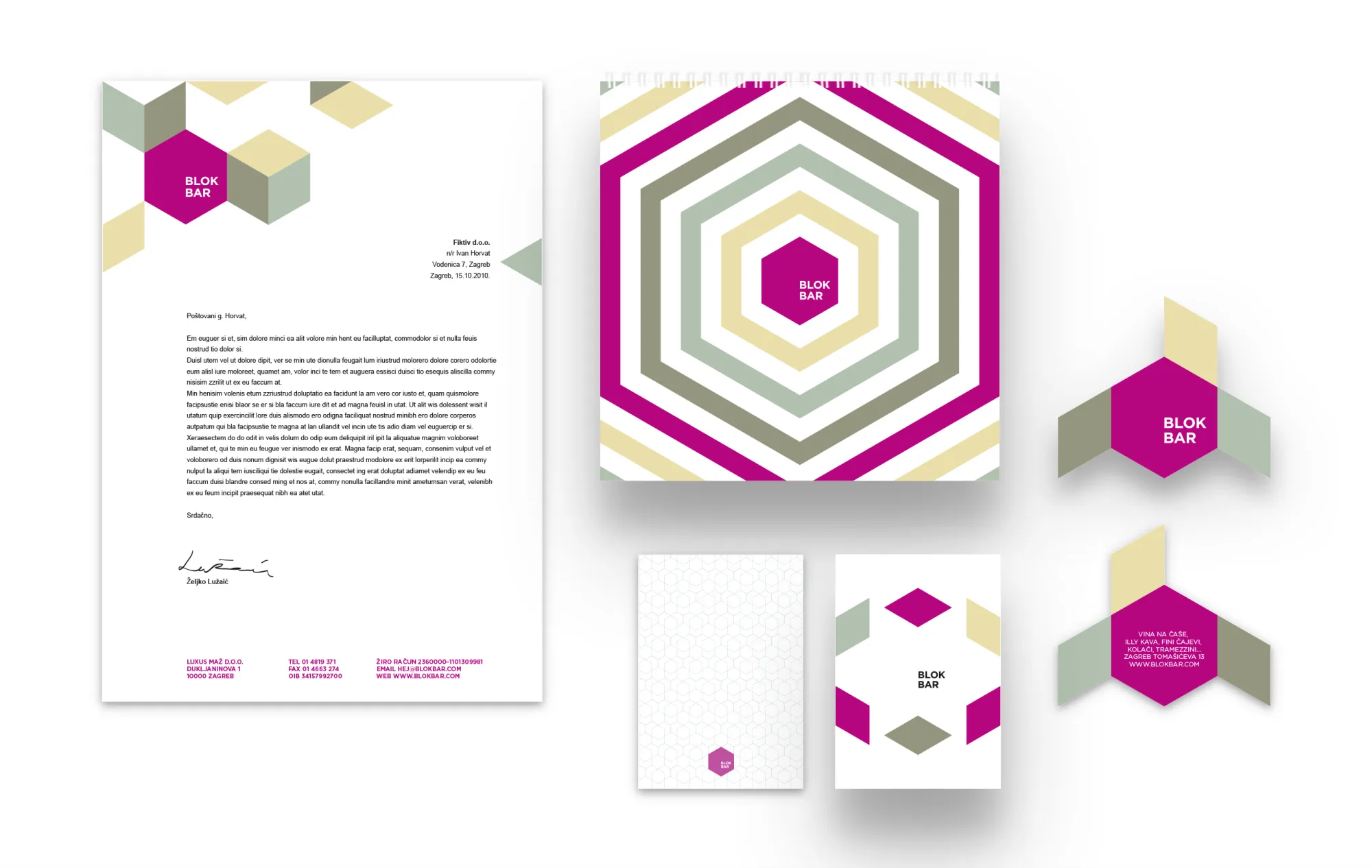
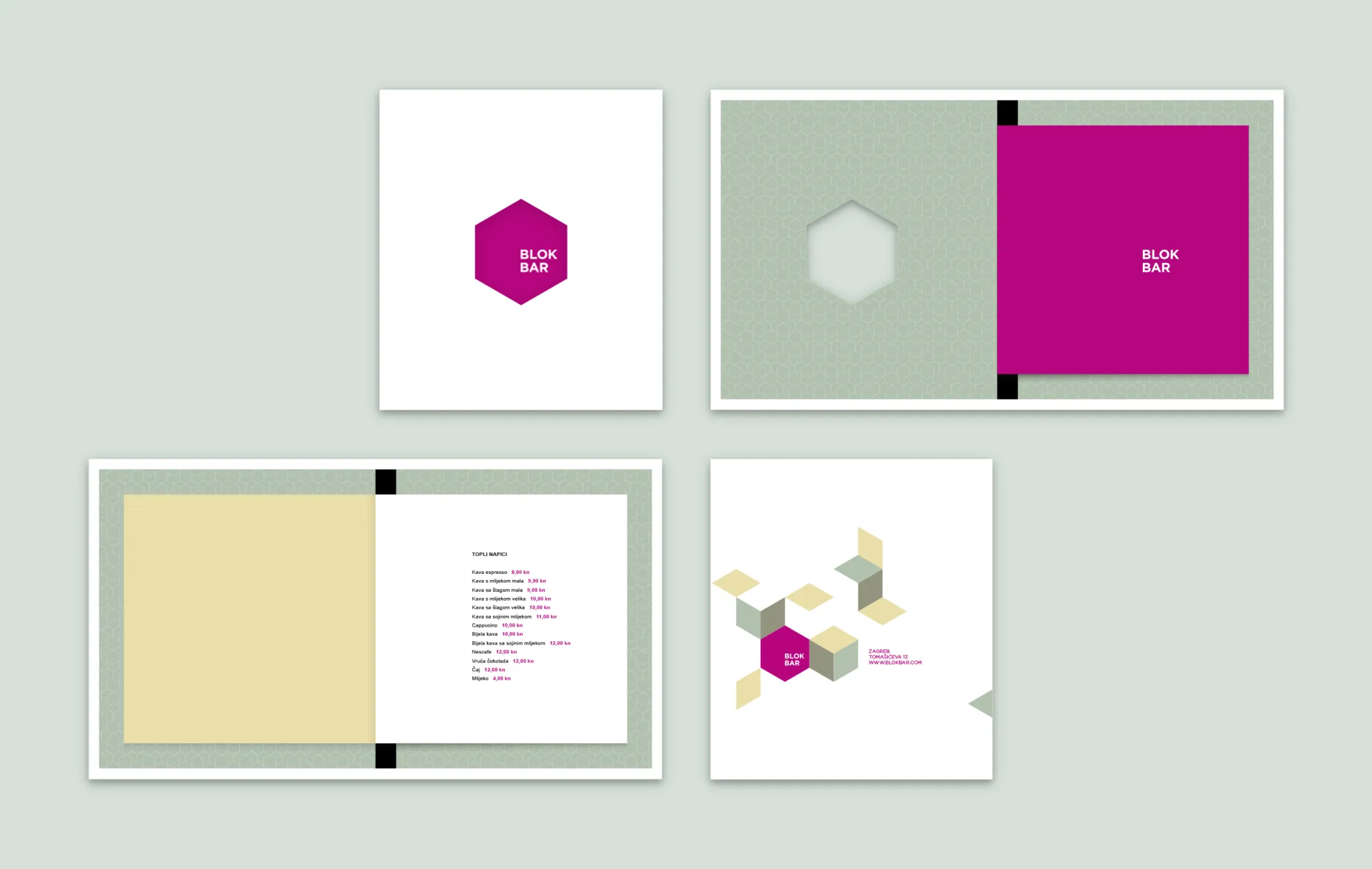
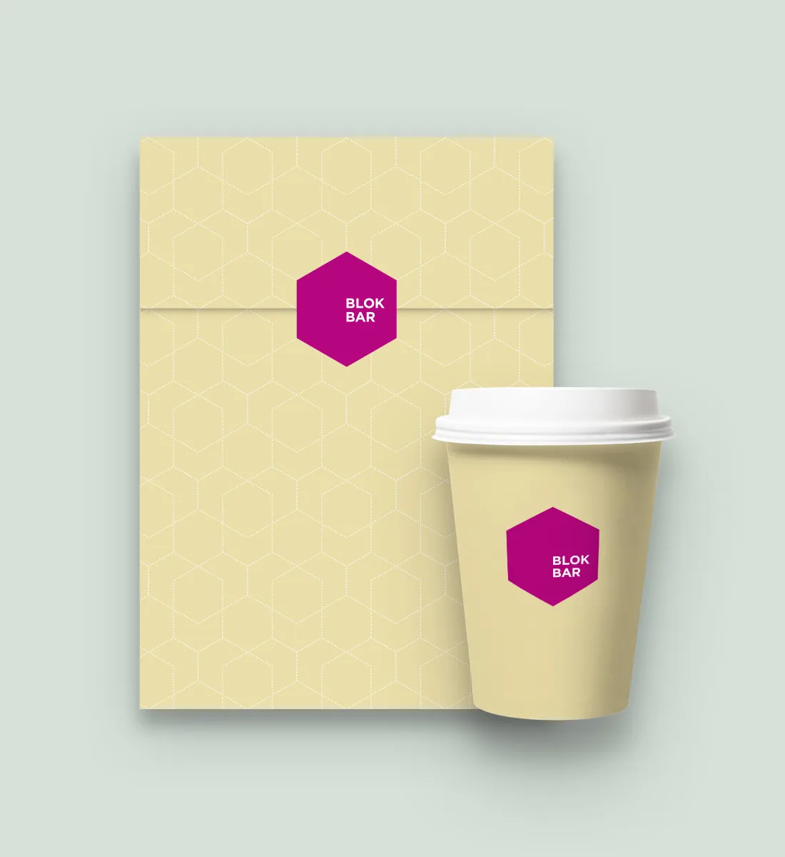
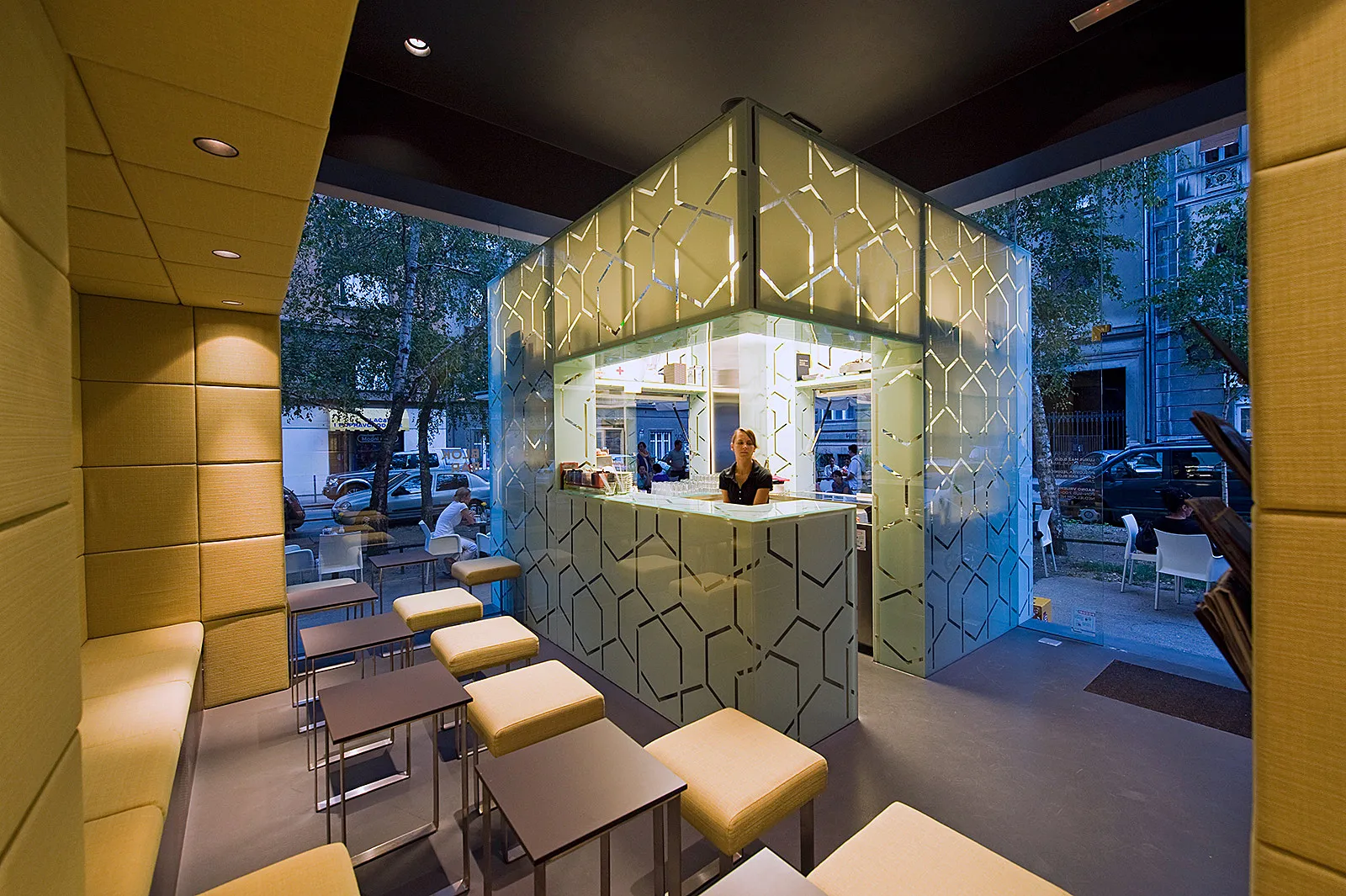
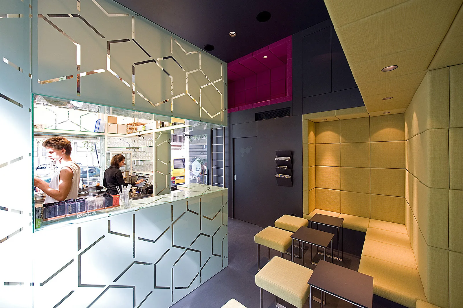
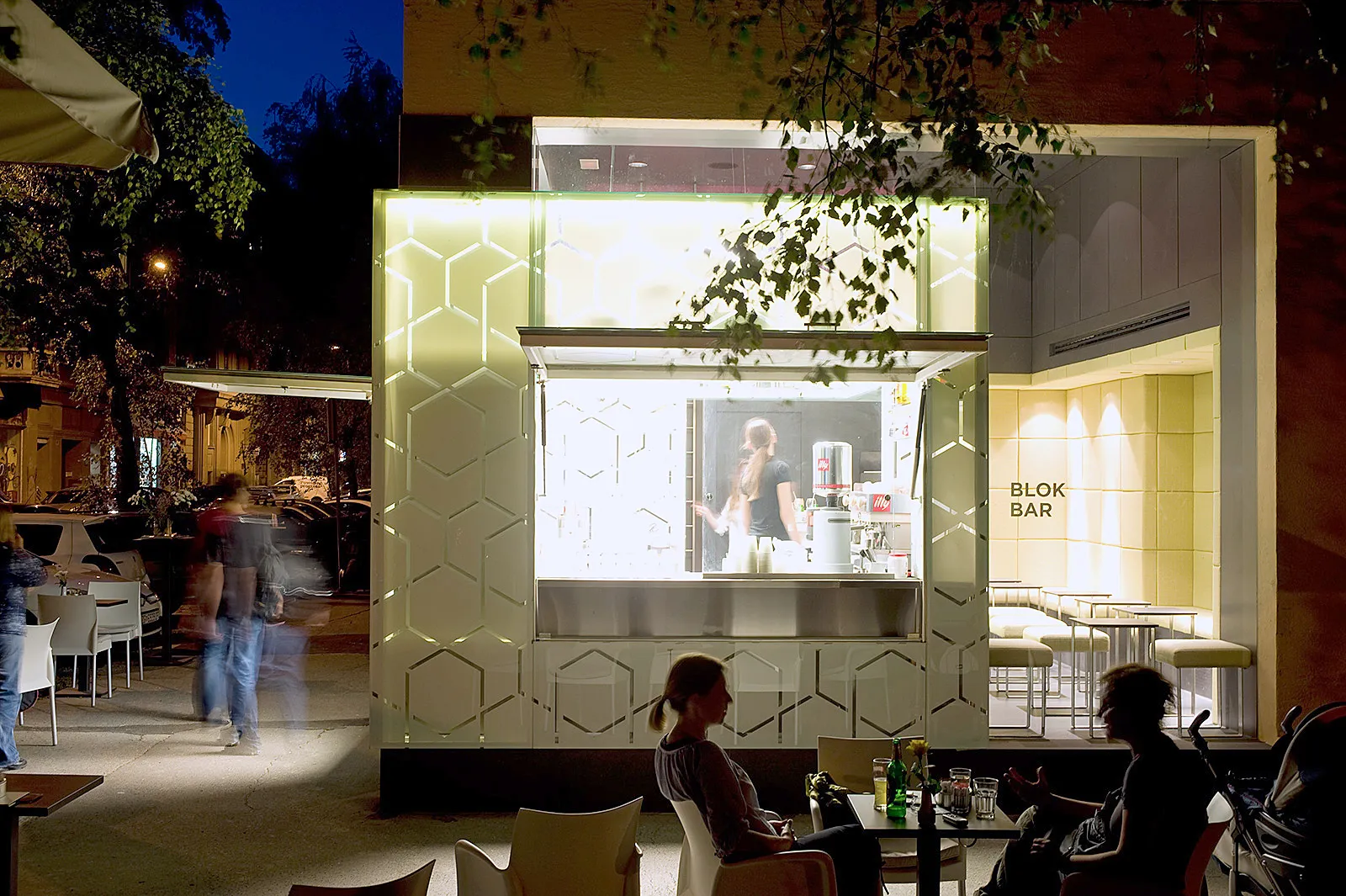
The idea of a "block" as a social, urban, contextual, and design element was consequently applied through the entire project, by creating a multivalent object which animates not only its interior but also the public city space surrounding it. This concept became "Blok bar," as we named it – a block for the local community that emerged from the pattern of characteristic Zagreb urbanity. The design concept would be communicated starting from the logo and visual identity, through the graphic pattern on a big glass cube in the middle of the bar, to graphic applications on interior elements, signage, pictograms, and related stationery.
It's a block (the tap area in the shape of a cube) within a block (the entire bar is a cube) within a block (the block of houses in which the bar is located) within a block (the urban area) — a block that opens, closes, constructs, and deconstructs, a living block that corresponds with its surroundings. This became the foundation of the architectural and design concept.
The basic symbol is a simple, closed, flat hexagon, a dormant block. In applications, it comes alive, forming a flexible visual system.