Lazareti Creative Hub
Project info
We were very much intrigued by the open tender for the visual identity of what should become the Creative Hub of Dubrovnik, rooted in the heritage of the Old City of Dubrovnik, and, of course, proud when Filburg's proposal was selected as the best one.
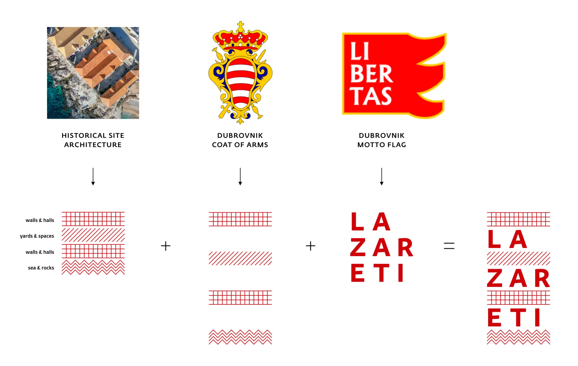
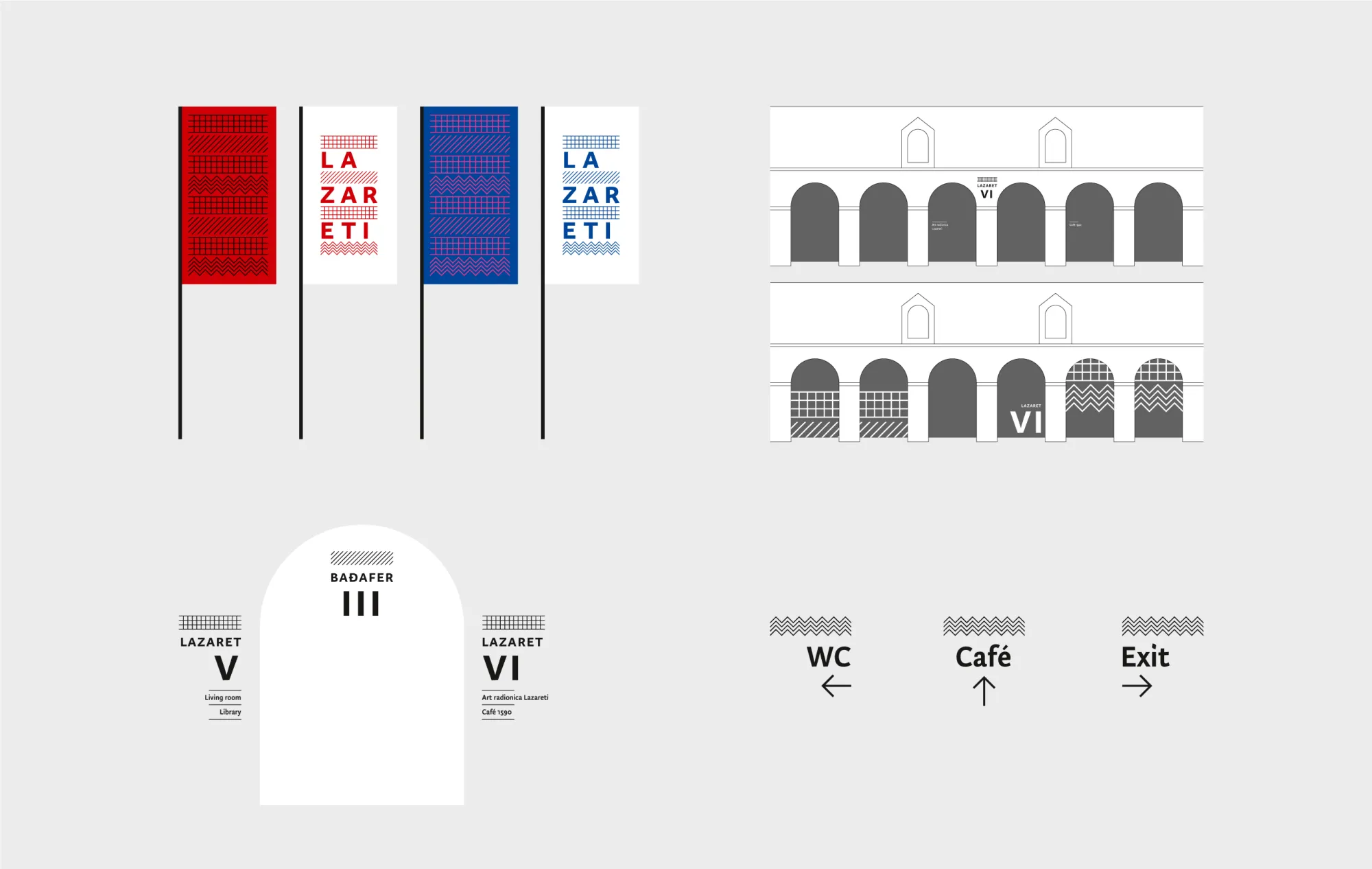
At the time of a plague epidemic in Europe, Lazareti – as this part of the UNESCO-protected old town has been called since the 14th century – were established as the first quarantine in Europe where anyone who wanted to enter Dubrovnik needed to stay for 40 days beforehand. It is one of the best-preserved quarantine buildings in the European part of the Mediterranean, uniquely composed of ten halls and five courtyards, one in between each pair of halls, oriented towards the sea on one side and the old city on the other. The complex has since served many purposes and is now being revived as common ground for different cultural content for the local community and the tourists.
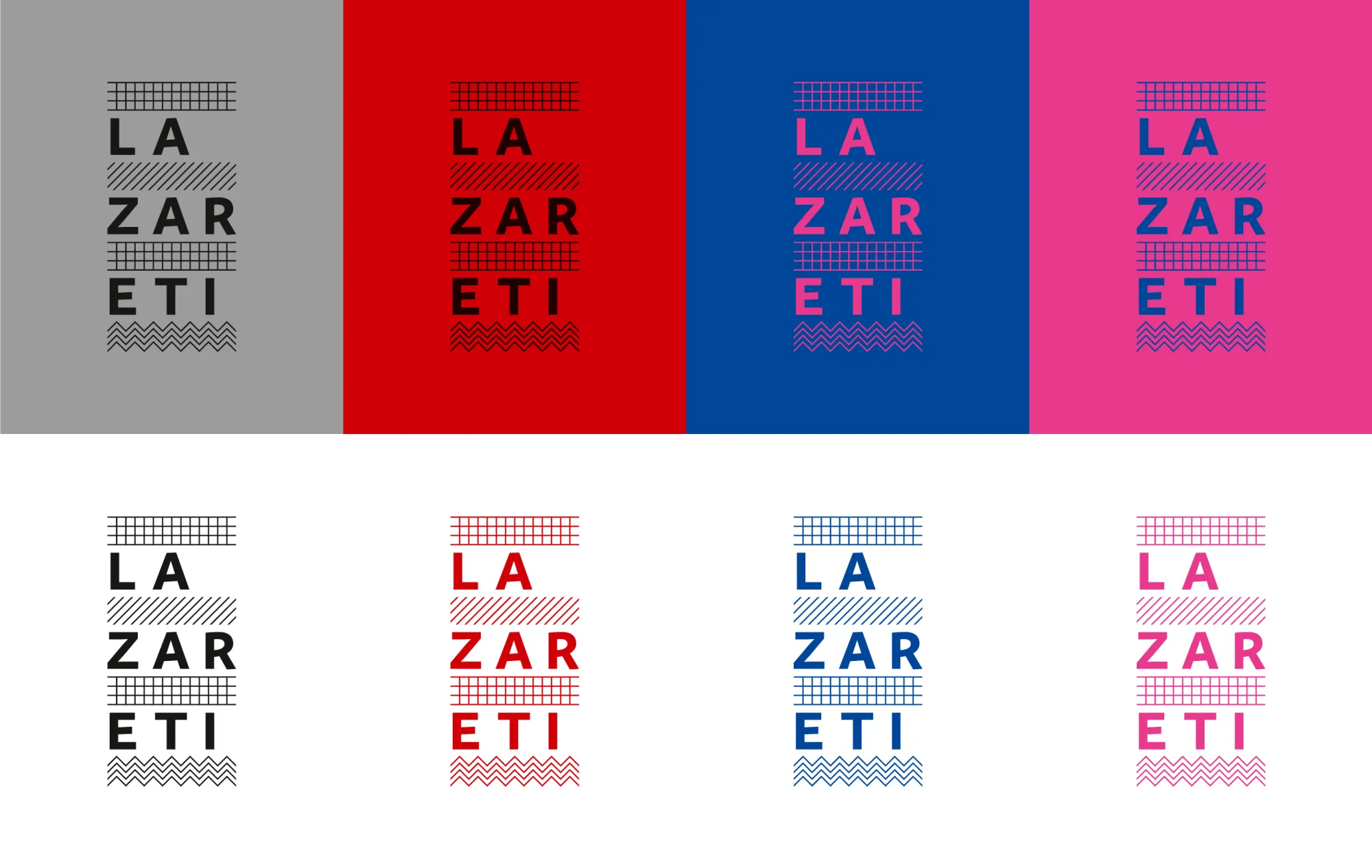
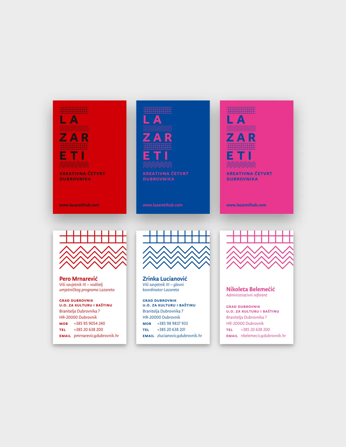
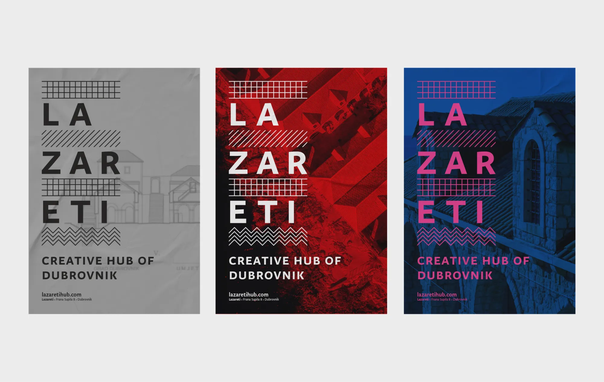
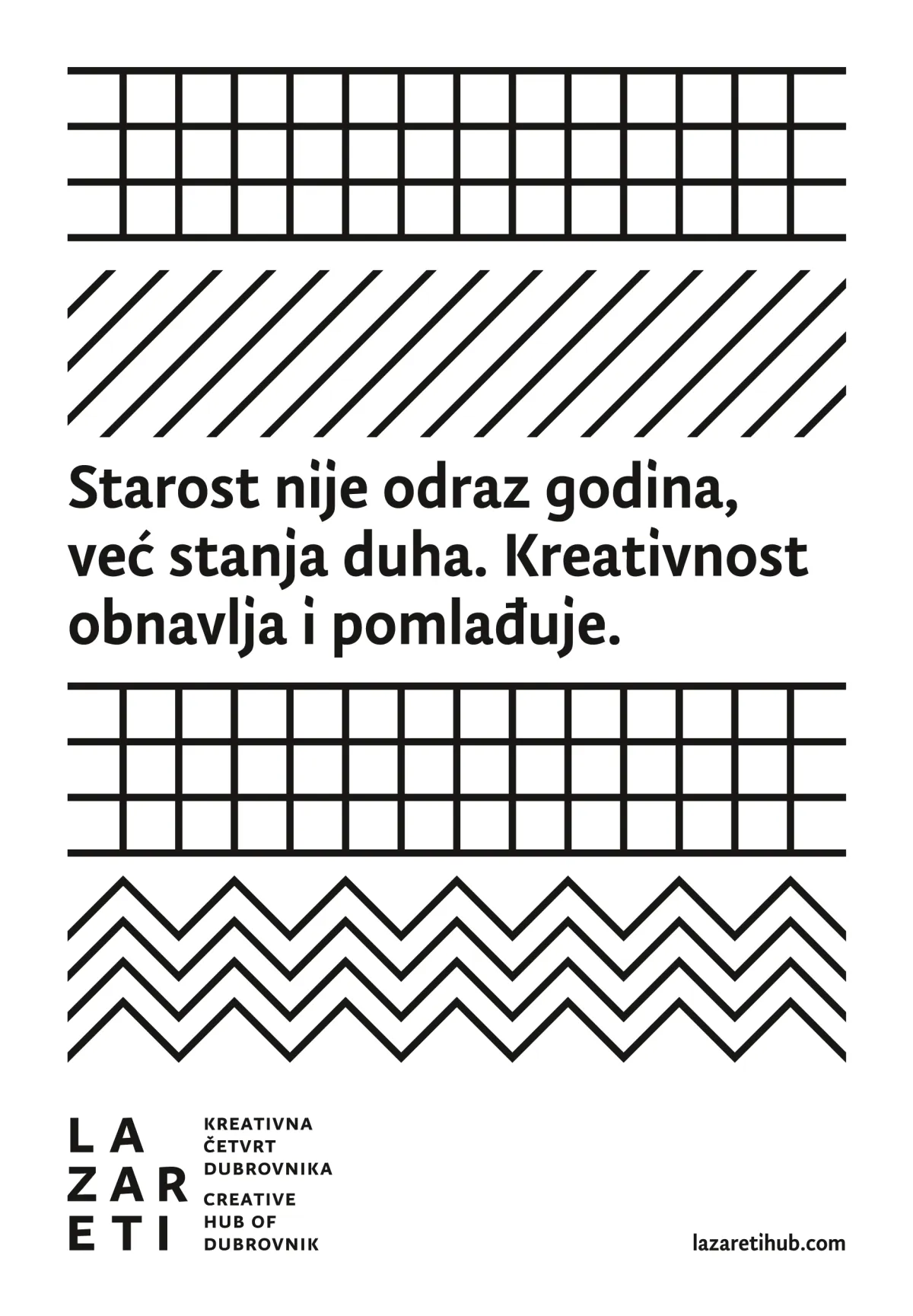
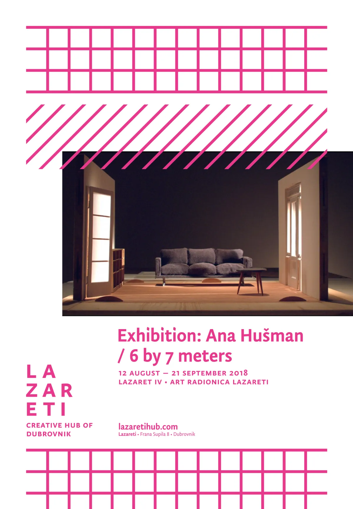
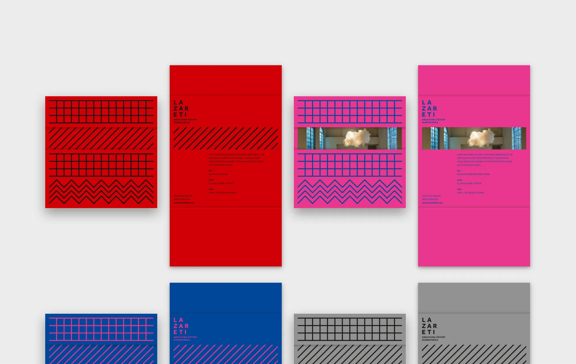
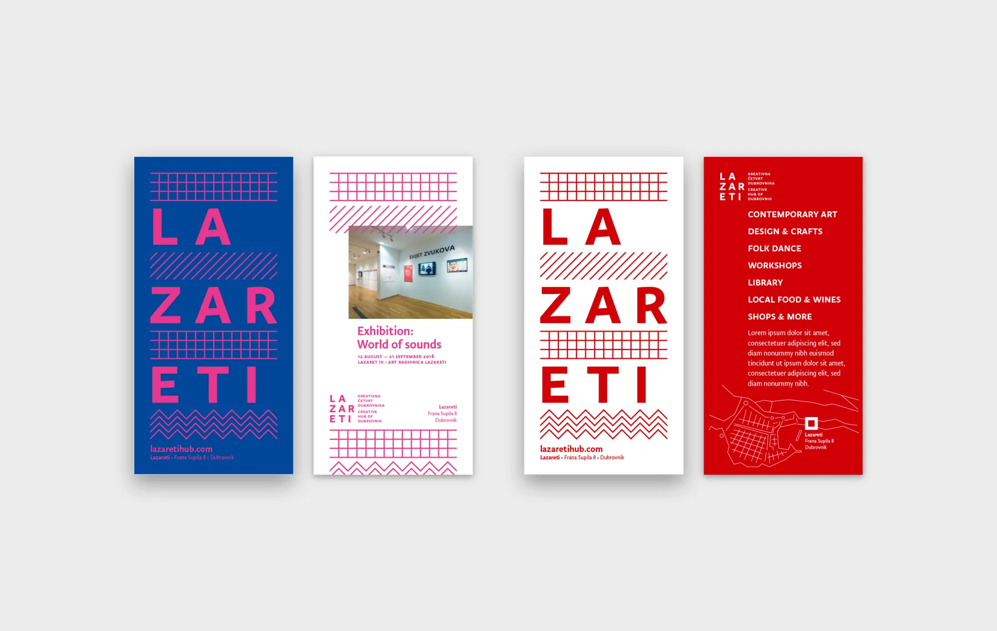
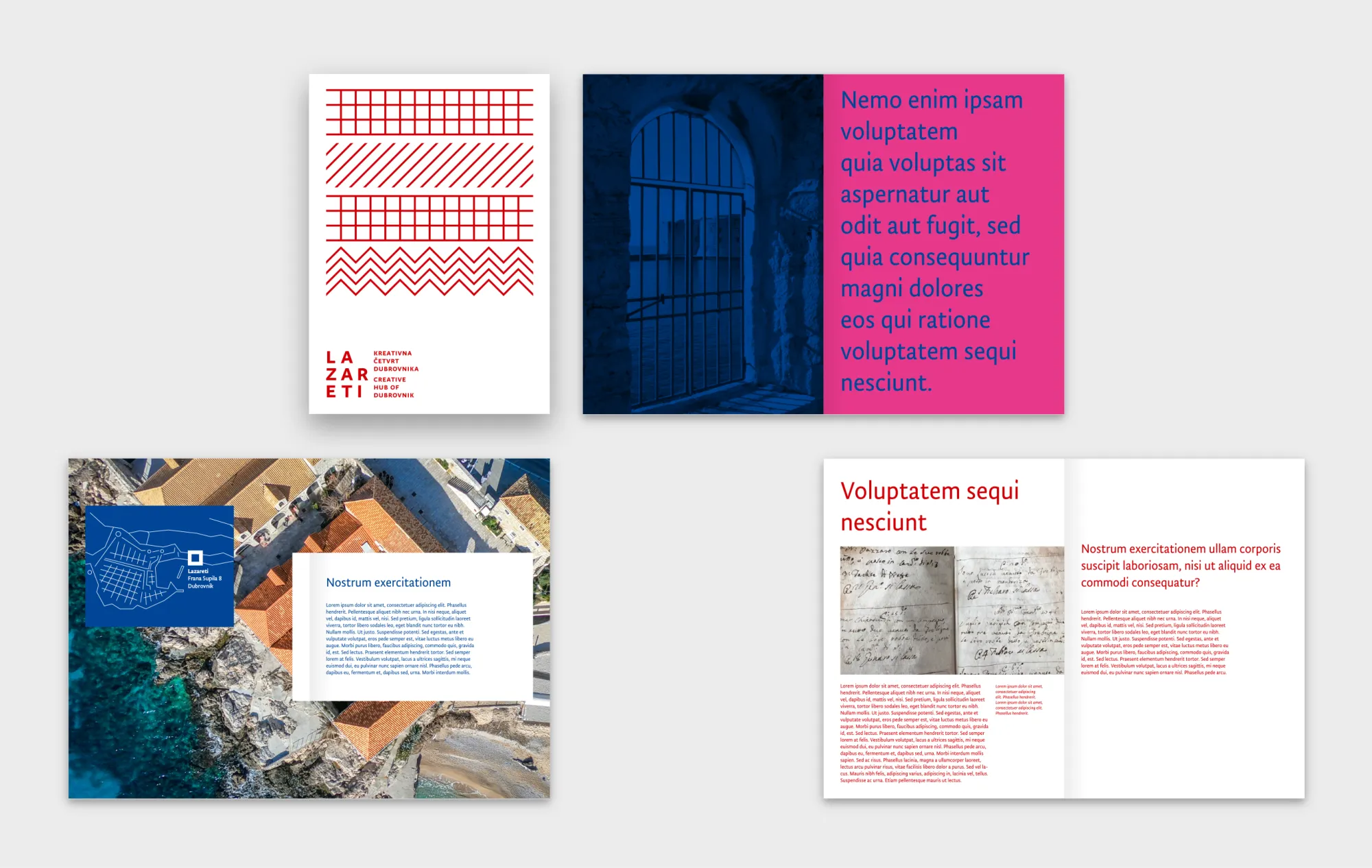
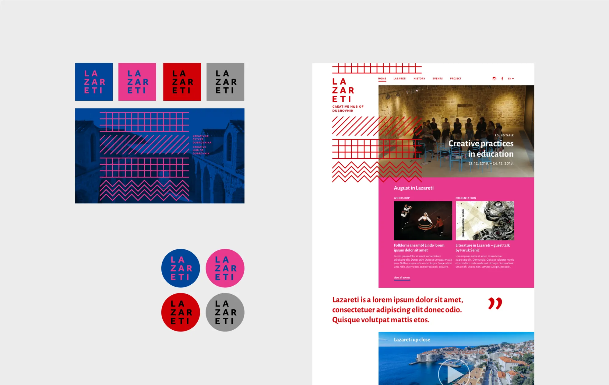
The visual identity combines natural and architectural motifs, Dubrovnik heraldry, and the idea of diversity. The sign is composed of four schematic textures symbolising the sea, the walls, and the open spaces, composed inside a square. Together with the logotype, they closely resemble the architectural rhythm of the complex itself, the repetitive interplay of closed and open spaces, of tangible and intangible.
The colour palette is derived from the Dubrovnik coat of arms with contemporary tweaks and accents, whilst the typography is based on a humanistic typeface designed by Croatian author Nikola Djurek.
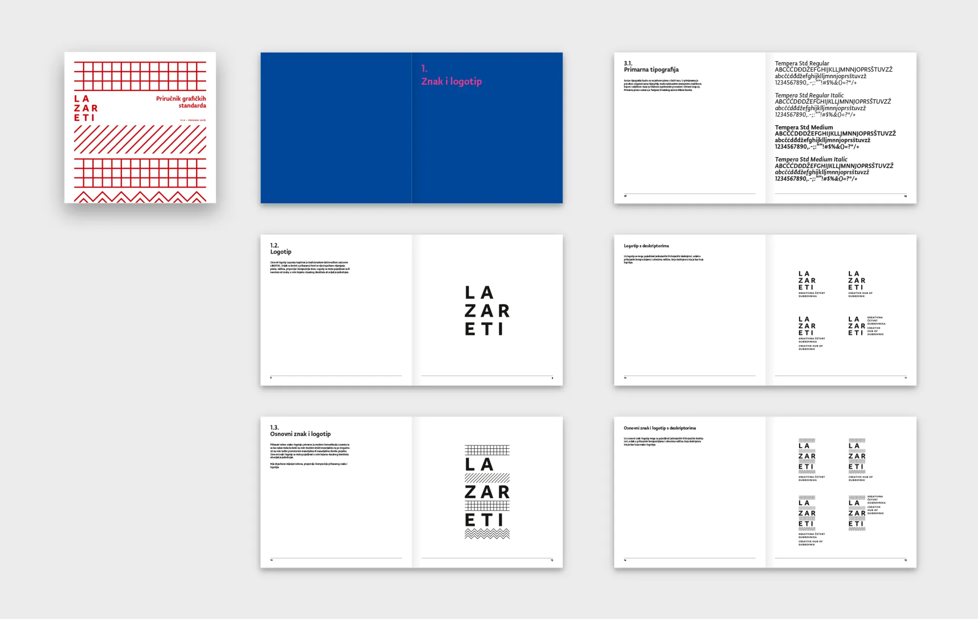
The visual system is built around several simple and robust principles which together result in varied flexible possibilities for expressing the new brand identity.