Spare Workspace
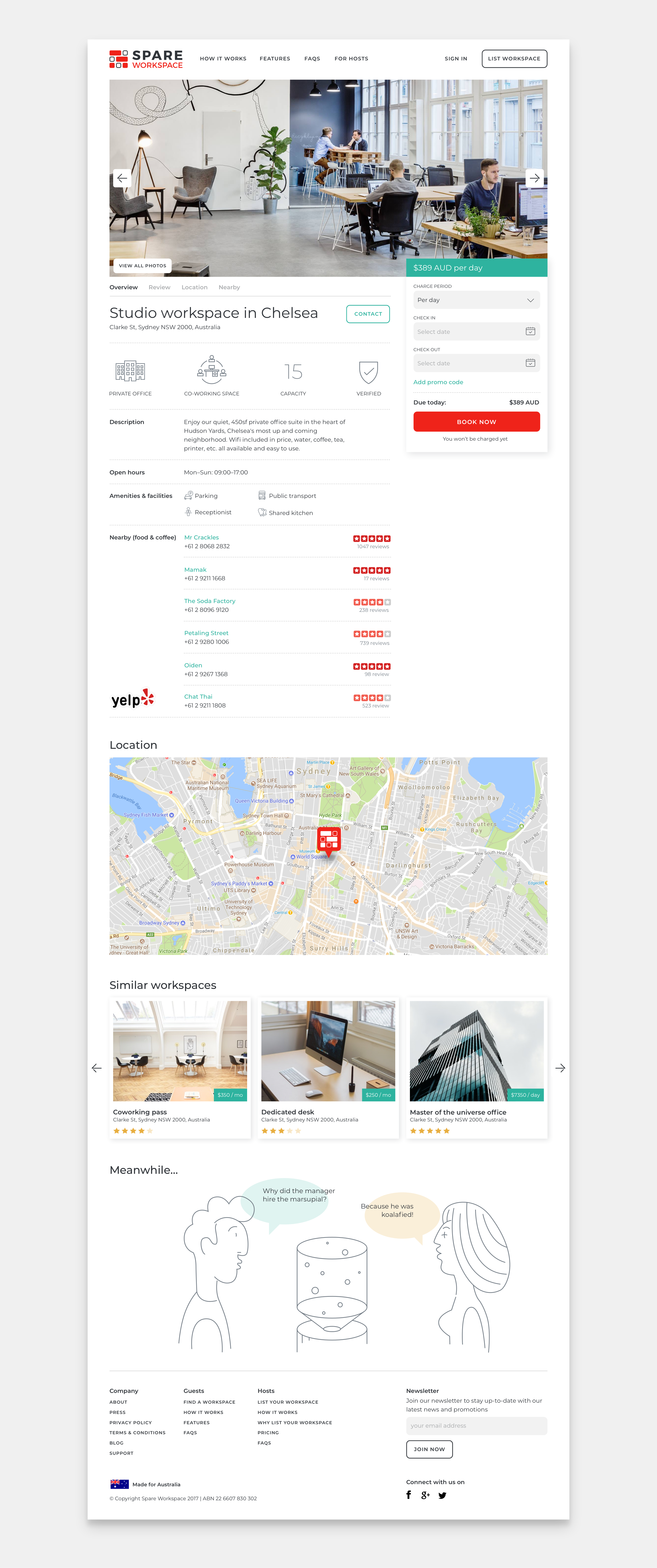


With an already designed and developed platform, Spare Workspace approached us wanting to take its design to the next level, making it cleaner, faster, and more characterful. We've built a style guide that ensures that any future developments of the platform are visually and brand consistent.
Spare Workspace is an Australia-based online marketplace that makes it easy for people looking for short-term workspace to connect with others who have a workspace to share. This B2B product targets co-working spaces, serviced offices, and private businesses with extra space as hosts, and digital nomads, remote corporate employees, and business travellers as guests.
The site receives 50–70% mobile traffic, so it is crucial for the user interface to work well in the responsive version. Design and technology can work great together if they are aligned with the goals set, and for this project it was of the utmost importance to cooperate closely and effectively with the project's development partners.
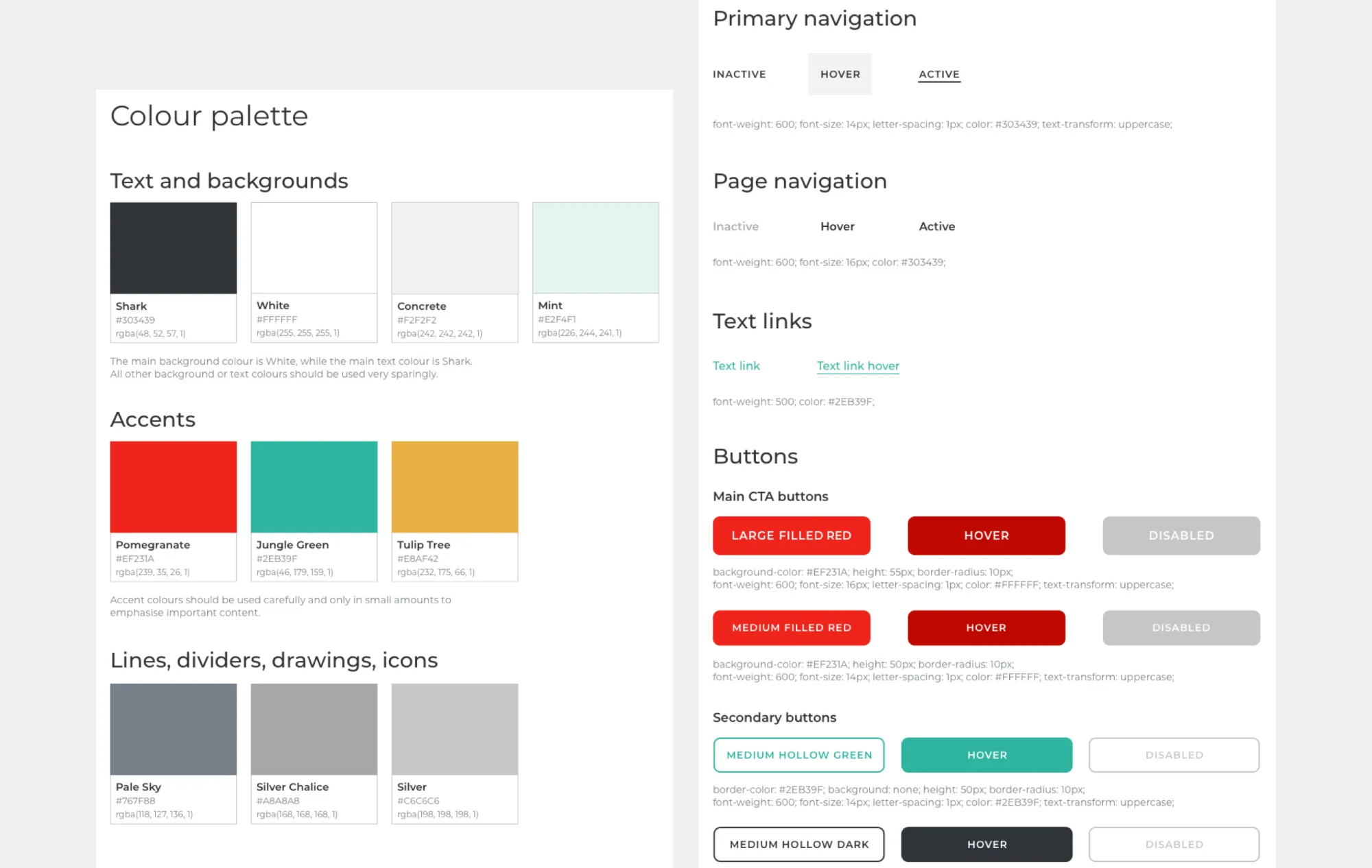
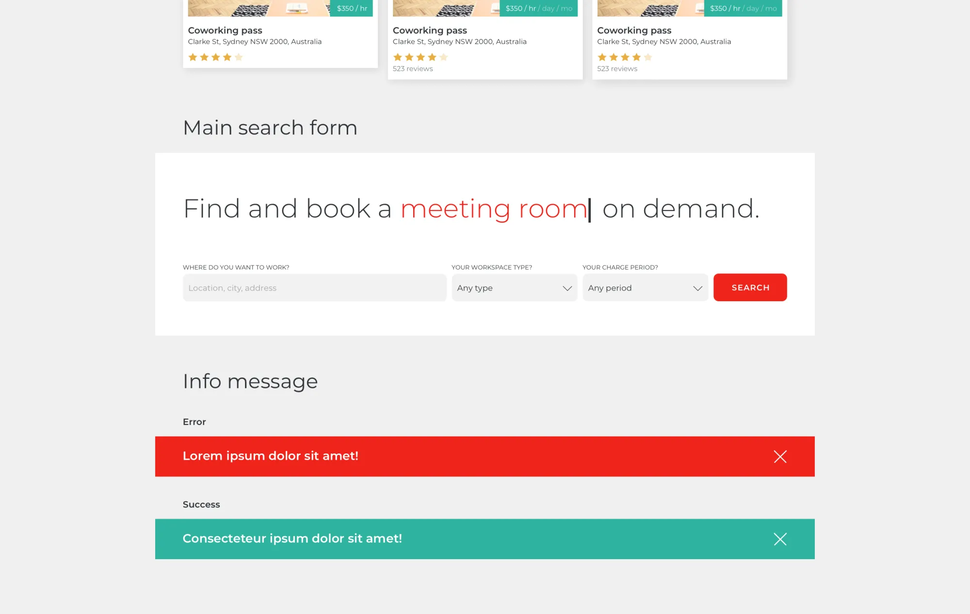
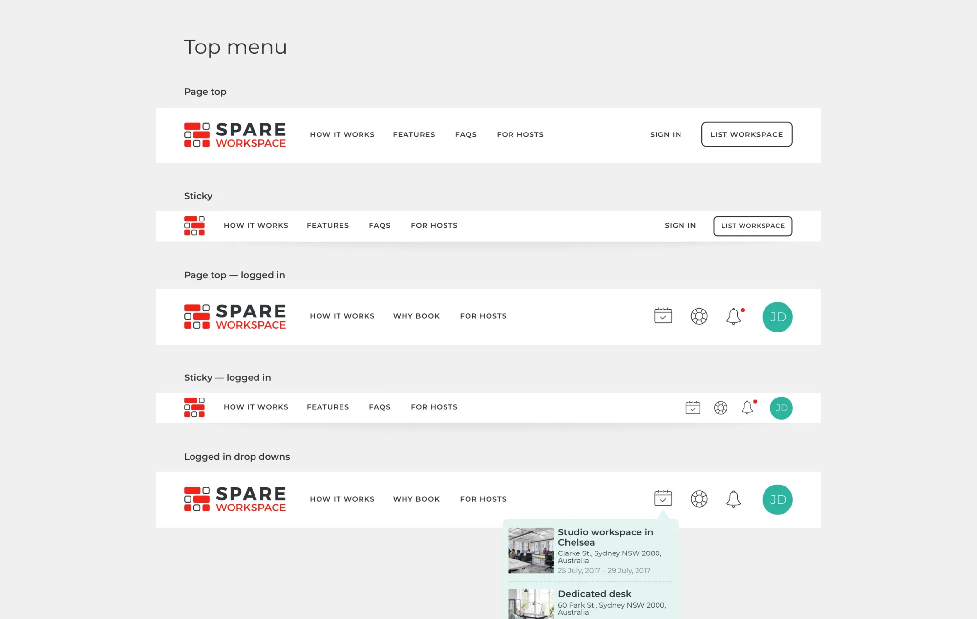
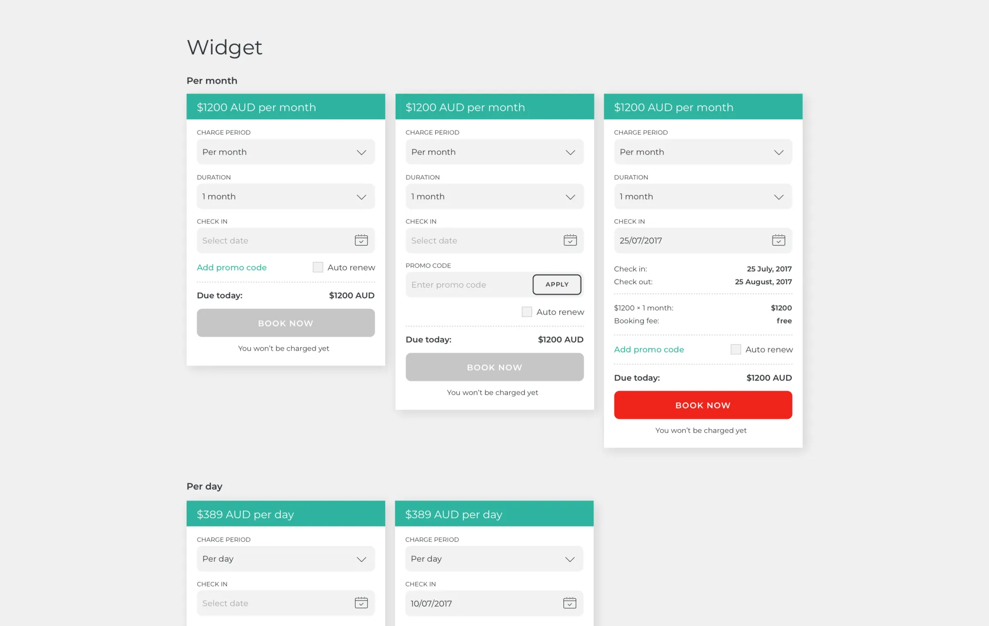
In order to ensure that all future developments of the website are visually consistent and reflect the brand in a recognisable yet unique way, we designed detailed UI style guidelines that will help developers implement new situations much faster and more easily. They cover everything from colours and typography to form styles, buttons, hover states, and additional elements.