Case study: Agency for Science and Higher Education
Background
When we took the job, there were multiple versions of logos, and the online presence was outdated. Treatment of external stakeholders like ENQA, EQAR, the Croatian state coat of arms, and similar institutional symbols were inadequately addressed in the visual representation of their website. The messaging about the organization's core mission and values was unclear.
Challenges
The greatest challenge was deciding how to use the Croatian national visual identity, since there is no official rule book in spite of it being used by multiple government institutions and agencies. The second toughest challenge was translating their archaic bureaucratic lingo into something more appropriate for online and interactive communication. To conclude this list, all of their photos were taken on a mobile phone, en passant, making them unusable on a new website or other materials.
Process
Every project starts with the client's needs and desired outcomes summed into a brief, followed by discovery interviews, research, and data gathering.
To be able to communicate with all stakeholders, measuring and defining the internal perception of the organisation was our first step towards the solution.
Aligning the presence of the international and national bodies that the Agency cooperates with, like ENQA, EQAR and others.
Implementing the new visual identity across the Agency for Science and Higher Education.
Solutions
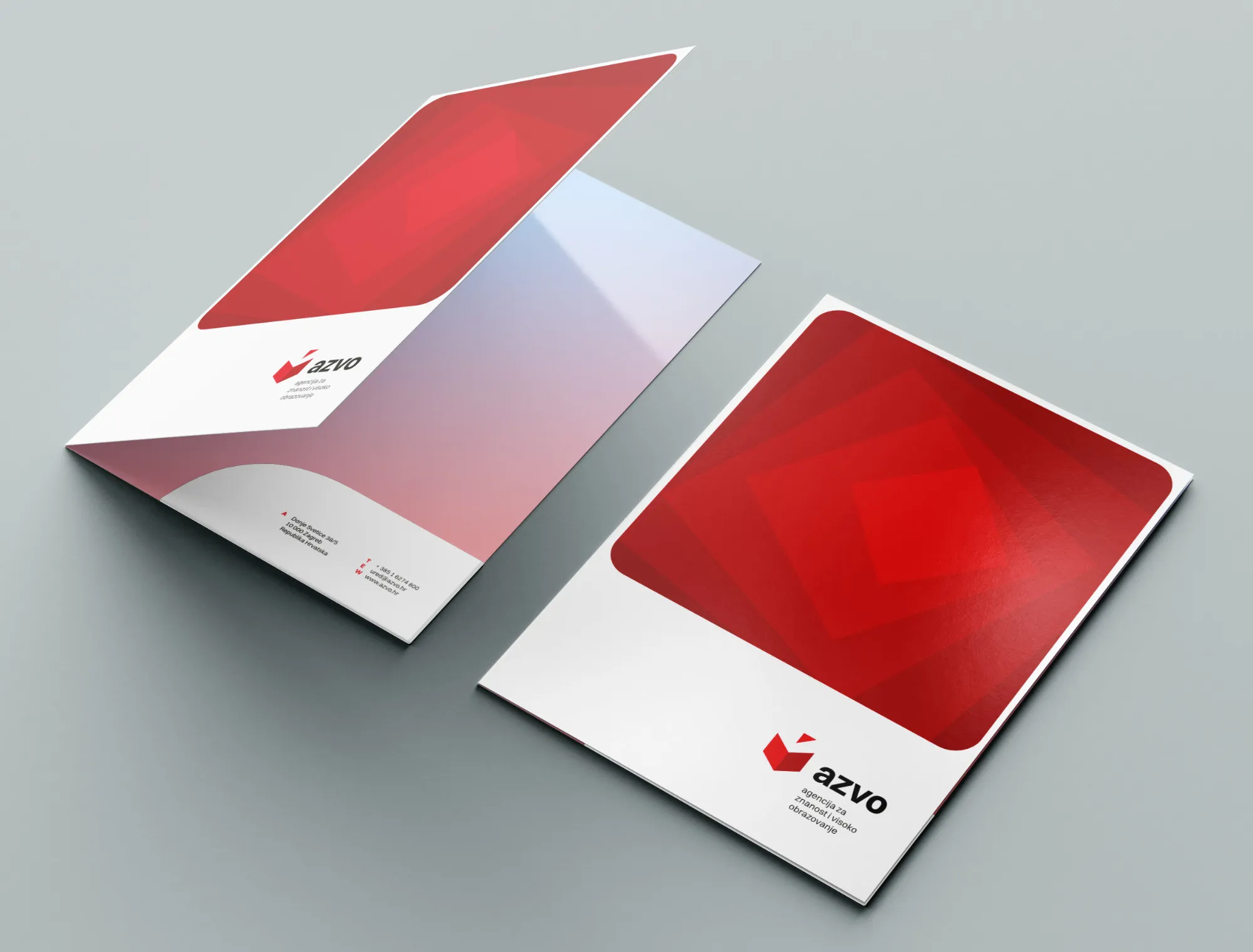
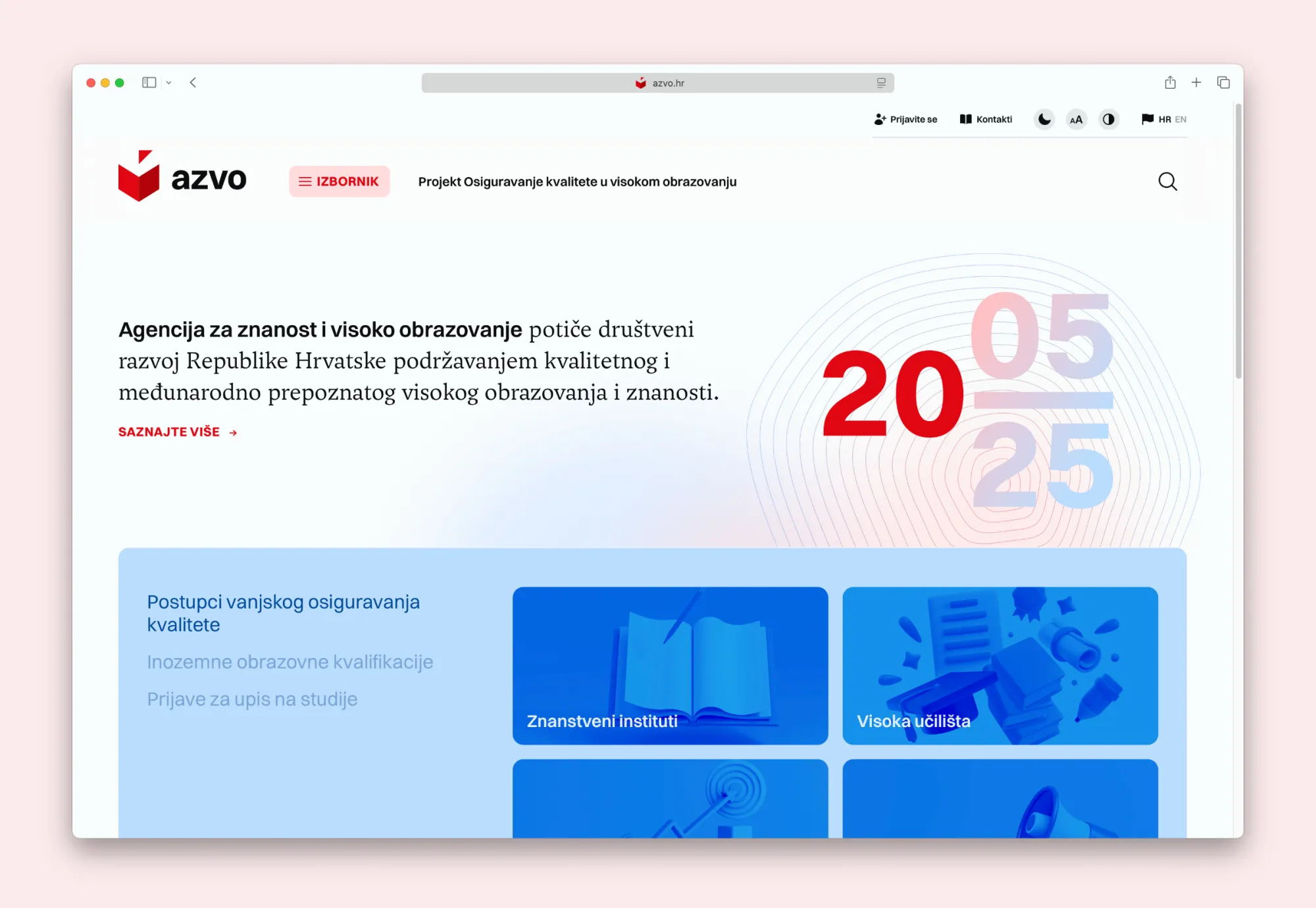
Next, we completely restructured their website, organizing it according to the best UX/UI practices and making it fully bilingual. We helped appoint a dedicated web editor to ensure editorial consistency over time. We delivered a full suite of standardized assets, including memos, newsletters, business cards, and email signatures.
Visual identity guidelines were created and made available online, ensuring every team member had access to clear, up-to-date version. Brochures, which had previously lacked uniformity, were redesigned under a cohesive visual framework.
This wasn’t about applying a new coat of paint—it was about building a foundation that works now and scales into the future.
Impact
AZVO now has a fully integrated visual communication platform that touches every part of their organization, including their website, visual identity, newsletters, office, digital stationery, and even a custom mark for their 20th anniversary.
Verbal and visual elements are fully aligned. Whether it’s a sentence on the website or a line on a business card, the tone and design speak the same language. Internal and external communication is built on clear, practical visual and verbal guidelines.
The redesigned website offers better navigation and stronger engagement.
Communication materials are instantly recognizable and consistent.
AZVO presence—online, in print, in the inbox, and the room—is now cohesive, professional, and future-proof. What once felt fragmented is now a living, breathing system with structure and intent.
“Throughout the entire creative process, Filburg demonstrated an exceptional understanding of our values, mission, and goals, and skillfully translated them into a contemporary, clear, and recognizable design expression. The outcome of our collaboration has far exceeded all expectations, and we are confident that the new visual identity you developed has made a significant contribution to strengthening the recognition and visibility of our agency within the academic community and the broader public.”