Case study: Ruđer Bošković Airport
Background
Dubrovnik Airport is a gateway to one of the world’s most iconic cities and a key interface between Dubrovnik and the millions of visitors it attracts. In 2024 alone, Dubrovnik recorded more than 4.2 million tourist nights, with 85% of arrivals by plane.
As one of the city’s largest employers and a vital link in the region’s tourism economy, this project brought together a broad group of decision-makers, including city and regional authorities, and paved the way for future developments.
Challenges
When the Dubrovnik Airport board decided to name it after Ruđer Bošković, a renowned 18th-century scientist and philosopher from Dubrovnik, they wanted to honor the city’s rich scientific heritage and forward-looking vision. Bringing in visual references to Boskovic and his work was not working, since his original works and portraits are at least three centuries old, with a distinctly archaic vibe. The second challenge was that the new name does not include the destination name.
The new identity needed to clearly communicate to international passengers, industry professionals, B2B airline partners and suppliers, regulatory bodies, employees, the local community, and the general public, ensuring recognition and functionality across touchpoints. Finally, integrating Dubrovnik’s cultural heritage was a challenge since there is no formally established official brand strategy for the destination.
Process
We began with discovery, involving a complex network of stakeholders. Understanding Dubrovnik’s strong cultural identity, which has been linked to tourism since the 19th century, was key to articulating the new message.
Filburg developed a new logo and visual identity elements, addressing the need for bilingual communication and the challenge of Croatian letters such as “š”, “ć”, and “đ”, which are strange or hard to read for international audiences.
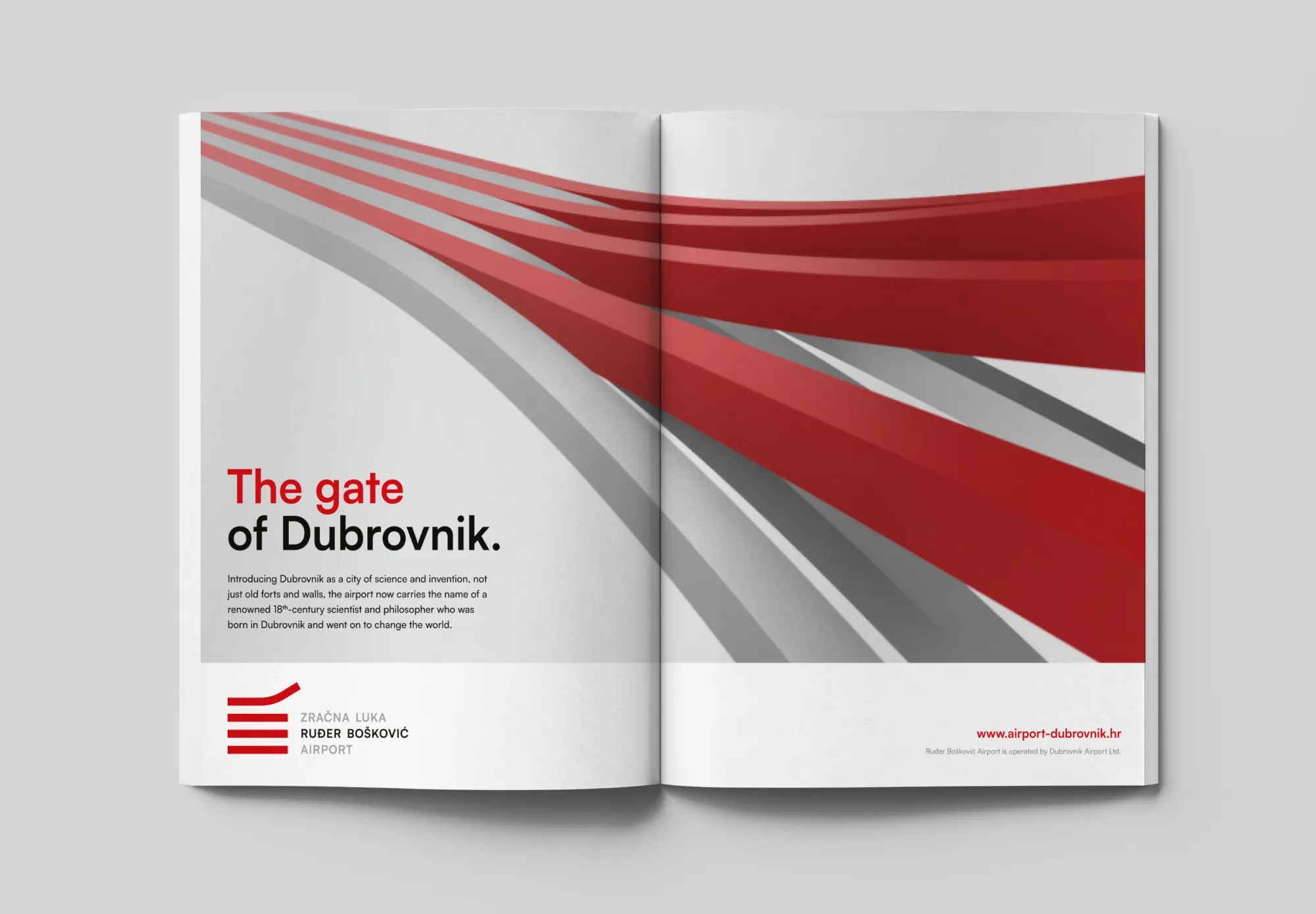
A new corporate slogan was created to support the brand’s visibility, mainly since the new name no longer directly includes the city’s destination.
The identity was then integrated across key brand touchpoints, telling the story with clarity and consistency.
Solutions
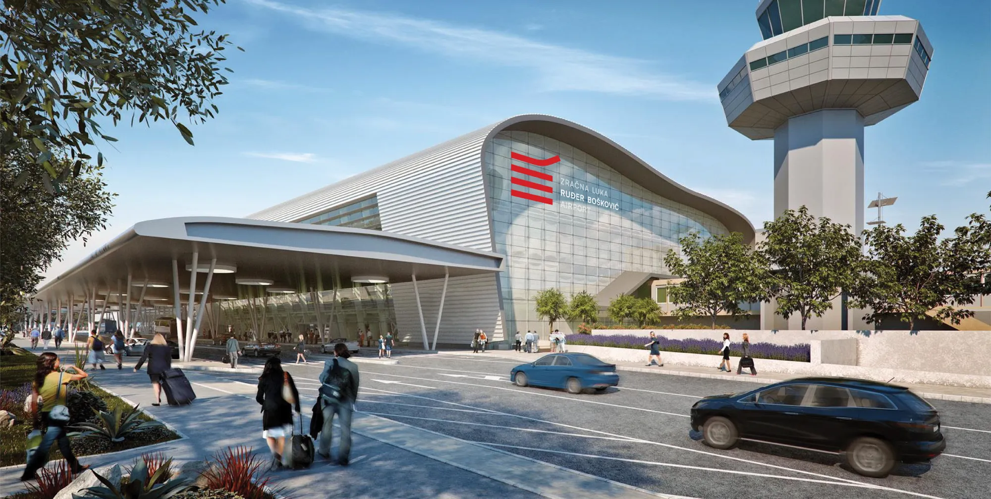
The logo design draws inspiration from the historical coat of arms of Dubrovnik, utilizing its colors and forms to establish a connection between the airport, the destination, and its rich heritage. The simple geometry evokes the airport runways and the moment of take-off, subtly adding movement and meaning.
Although there is no formal destination brand strategy, the solution aligns with the visual tendencies of major local destination management companies (DMCs). Typography is clean and neutral to ensure legibility in both Croatian and English. The airport acronym DBV is used functionally on the website.
The core elements of the logo are extended into spatial and animated compositions, adding movement and rhythm while conveying the elegance of Dubrovnik as a destination. The color palette and typography ground the identity in heritage while positioning it within a dynamic and passionate context. The system is scalable and consistent across signage, digital platforms, uniforms, and printed materials, preserving clarity and coherence at every touchpoint.
The second layer of the identity draws on cultural heritage by featuring Ruđer Bošković’s portrait as a key visual element. An 18th-century physicist and philosopher, Bošković is a celebrated figure in Croatian history and science. His image connects the airport, blending tradition with a modern identity.
Since the new name—Ruđer Bošković Airport—did not mention Dubrovnik, we added a corporate slogan The gate of Dubrovnik referencing the city’s historic gates: like the Pile Gate, the main entrance to the Old Town for centuries. As most visitors now arrive by air, the airport is the modern gateway to the city. The Croatian version, Vrata od Grada, employs the familiar local expression, establishing a resonant connection with the community.
Digital platforms, including the airport website and social media, feature the updated identity for precise and consistent online engagement. Branded merchandise such as VIP lounge cards and airport bags extends the airport’s identity into tangible, high-quality touchpoints. Airport transport vehicles and interior spatial graphics convey the visual identity throughout the physical environment, thereby enhancing the traveler's experience.
Impact
Strengthened image of Dubrovnik by extending the heritage brand of the destination to a modern transportation hub, signaling economic ambition. The business synergy between the airport, city, and tourist board management is already in place, forming a united front in large-scale negotiations and common projects.
During the same period, major airlines such as Ryanair, EasyJet, and KLM (Dutch) introduced Dubrovnik to their flight schedules, while United Airlines expanded its seasonal service from Dubrovnik to New York.
Qualitative assessments through local stakeholder interviews yielded positive feedback and a favorable perception of the rebranding.
It has contributed to business growth, with a marked increase in passenger traffic and aircraft operations compared to previous years.