Case study: The Garden Festival
Background
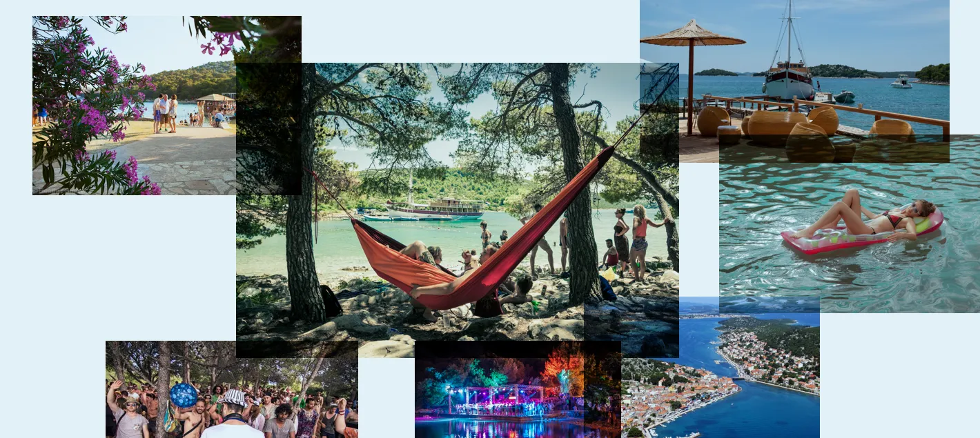
For an entire decade, Filburg has followed and enabled The Garden Festival, a music event that pioneered the renaissance of Adriatic music festivals. Founded by Nick and Charlotte Colgan in Zadar, The Garden Festival attracted over 20,000 annual visitors, primarily British professionals with distinctive “friends and family” rave culture atmosphere and world-class DJs across multiple venues and party boats.
Challenges
The greatest challenge was rapid execution with tight deadlines following artist confirmations. This meant working in a dynamic production environment while managing multi-stakeholder brand ecosystem coordinating partners, bands, performers, VIP guests, catering services, accommodation providers, and numerous other vendors to ensure cohesive brand execution across festival materials, like wristbands, accreditations, programs, mobile applications, websites, flyers, menus, stage backdrops, festival currency, merchandise, bags, backpacks, umbrellas, various promotional items. Working for a festival meant constant adaptation to changing information, weather contingencies, and program modifications.
Process
Building a festival brand needed a different approach than “static” branding, since it encompasses multiple narratives and audiences, it had to be more modular and approachable, evolving year after year, drawing inspiration from atmosphere, goings on, and experiences.
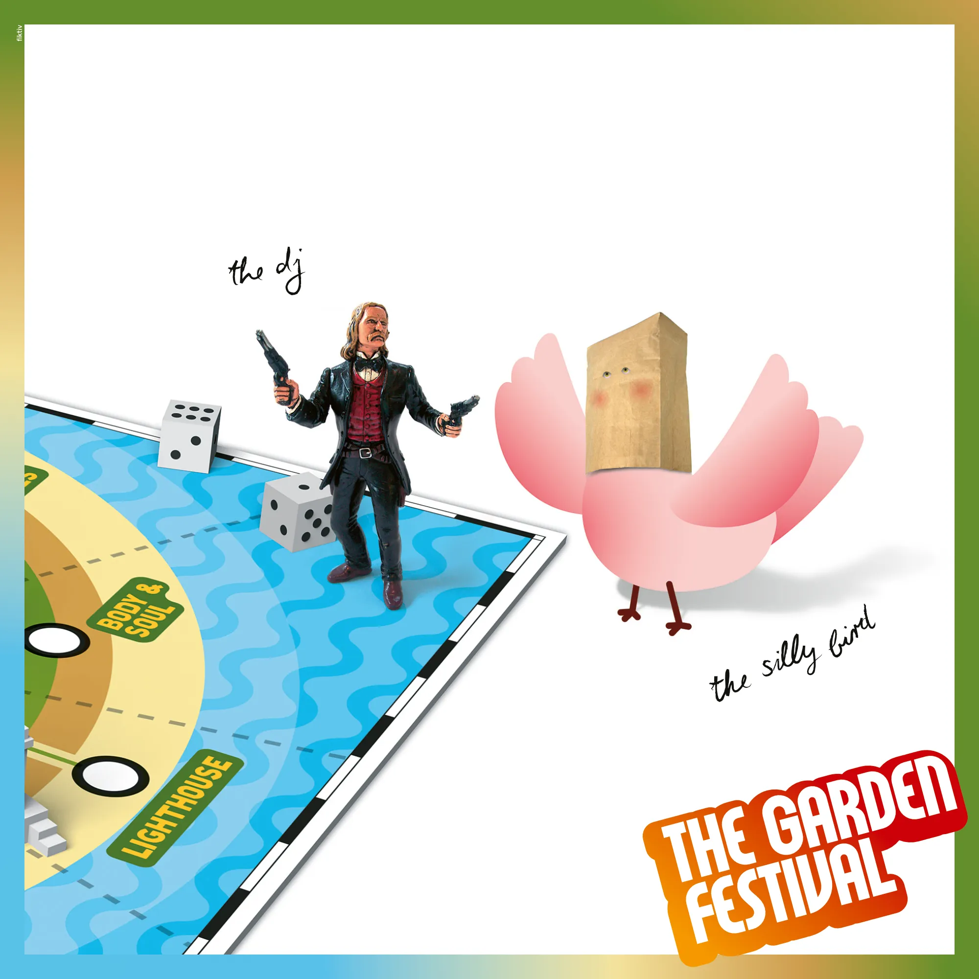
To be able to tell all these different stories, we created a mascot – Silly Bird, which allowed organizers and visitors to have a "personality" to connect to and draw inspiration from.
Once we had all of the obligatory elements in place, production planning had to be spot on, and pa lan for all eventualities.
Implementation was equally demanding, as it spread across stages, locations, boats, and situations.
Solutions
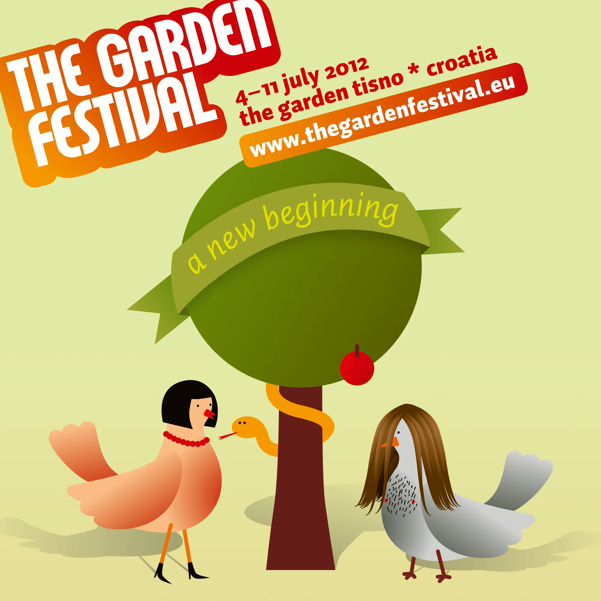
Every year, the birds would tell a different story, through different visual identities with a hint of familial connection between them. Identity played right into the special feeling of “experiences for friends and family” that became the essence of the brand platform.
As they opened The Garden Brewery, new brand architecture and visual identity considered all that, establishing a new hierarchy with their parent brand, The Garden through the family’s coat of arms, standardised naming of individual brands, and a unifying but flexible identity system.
The first series of cans that launched The Garden Brewery consisted of two beers, Adriatic Pale Ale and Session Ale. The simple packaging visuals aimed to introduce the brand and reinforce its visual language, preparing the stage for future releases. Currently, The Garden Brewery has over 30 different styles in their webshop.
Impact
Filburg created an opportunity for festival goers' emotional attachment through brand building.
A social media presence made sense, regardless of how much we twisted the story and visuals.
The bird mascot is famous and recognizable, with the recent 25th anniversary AI development of further Silly Birds.
Limited edition merchandise was constantly sold out.
Emotional values of the festival were transferred onto the beer brewery brand, which was instantly popular.
The identity system keeps growing with the company, covering every new product.