Cro libertas
Project info
In a public tender for the new visual identity of the new CROLIBERTAS toll collection system, Filburg's proposal was awarded 3rd prize.
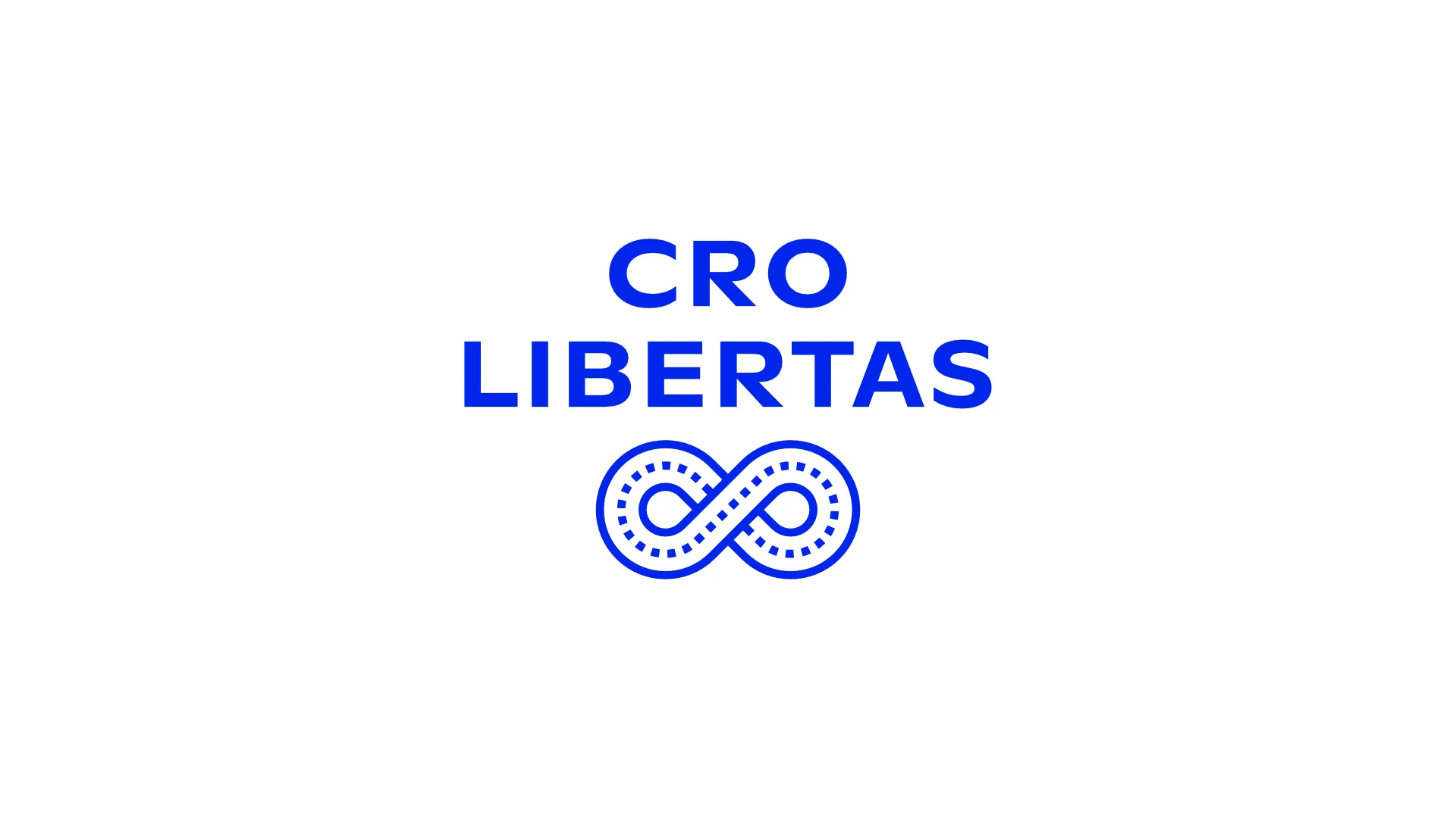
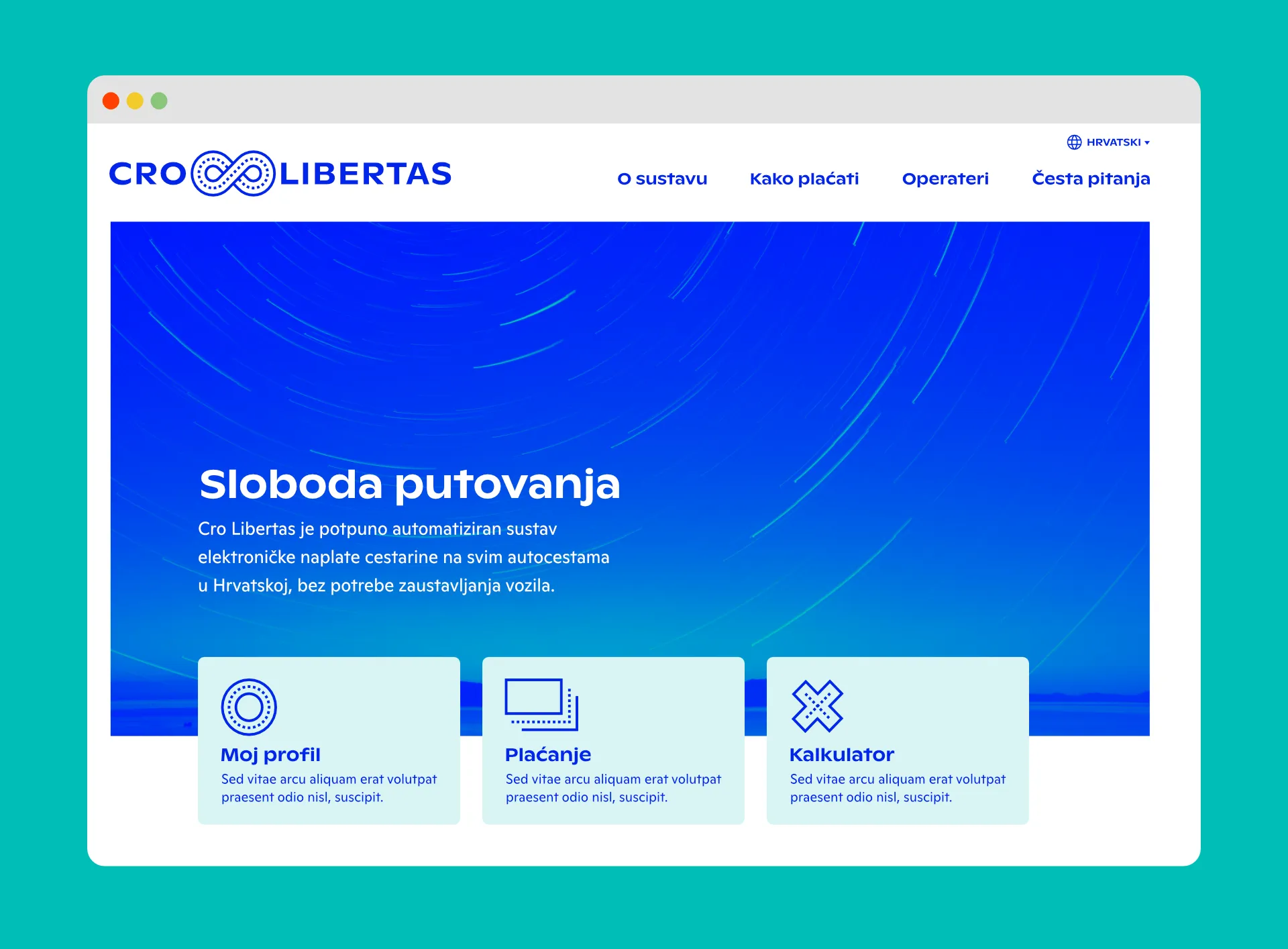
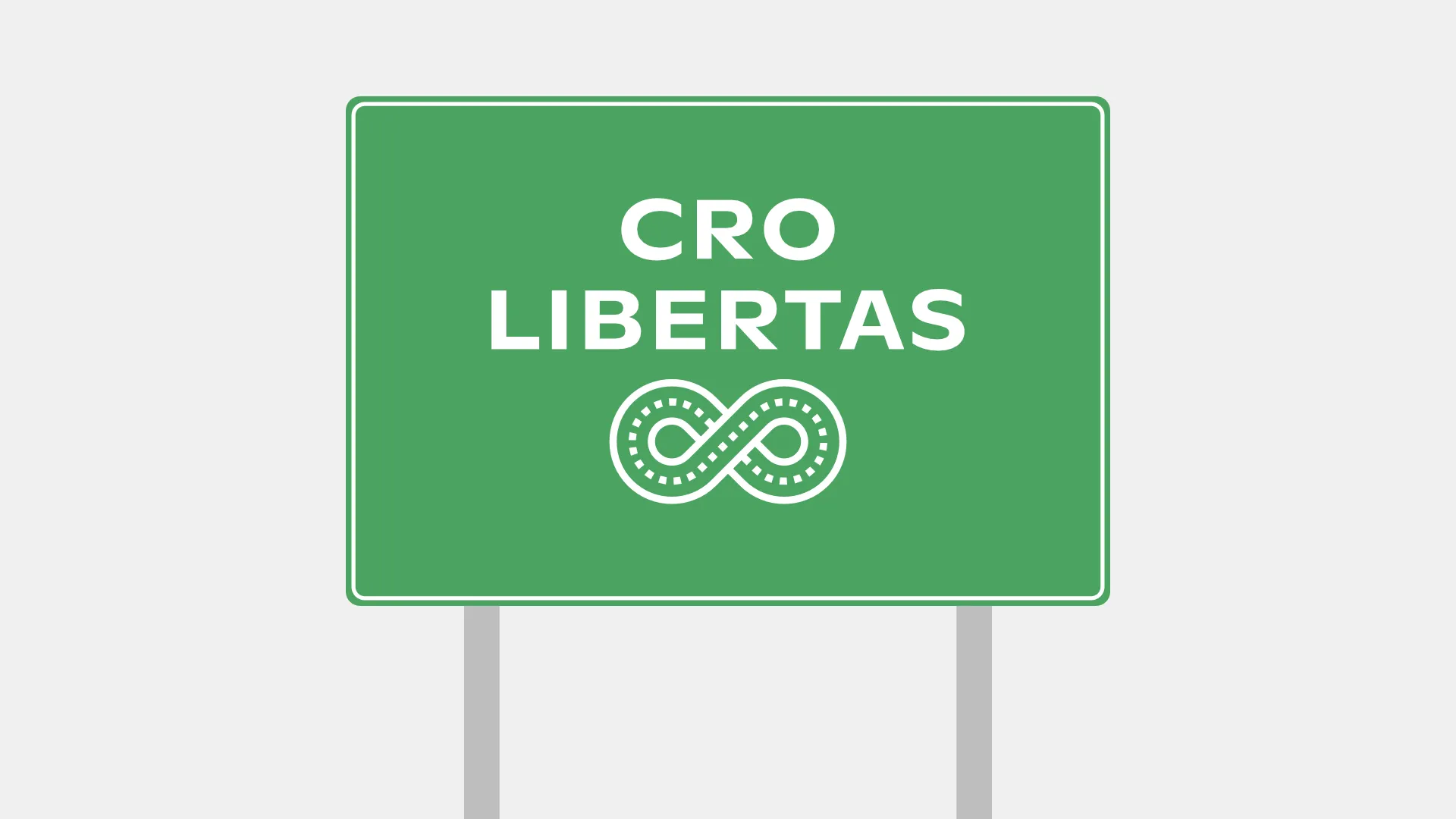
Responding to the project brief that required communicating the fundamental idea of free flow as the epitome of Croatia's new contemporary toll collection system, we selected the symbol of an infinite curve as the core mark of the proposed visual identity. Interpreted in a manner that suggests endless, free movement whilst simultaneously evoking motorways and vehicles travelling along them, the mark is simple in construction, monochromatic, and practically symmetrical on both axes. In terms of communication, this approach enables maximum accessibility and understanding of the form for the widest range of audiences without trivialising the concept itself. Technically, it ensures legibility and recognition of the mark even in challenging situations, such as extremely small sizes, screen resolutions, or when it is partially covered.
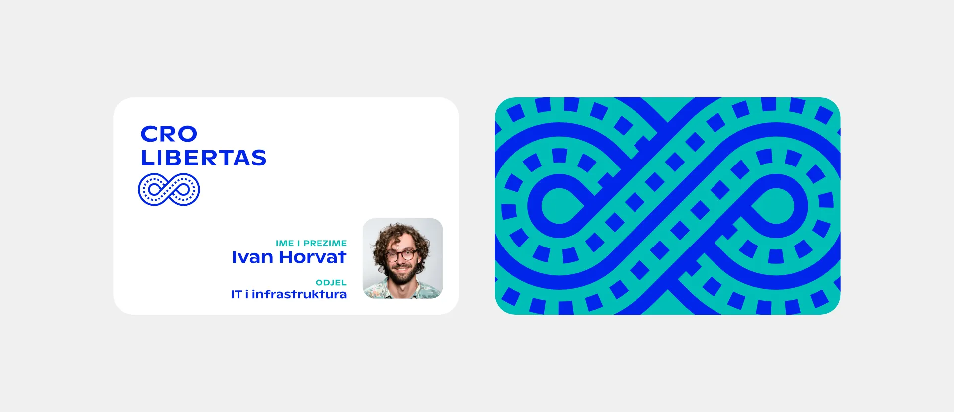
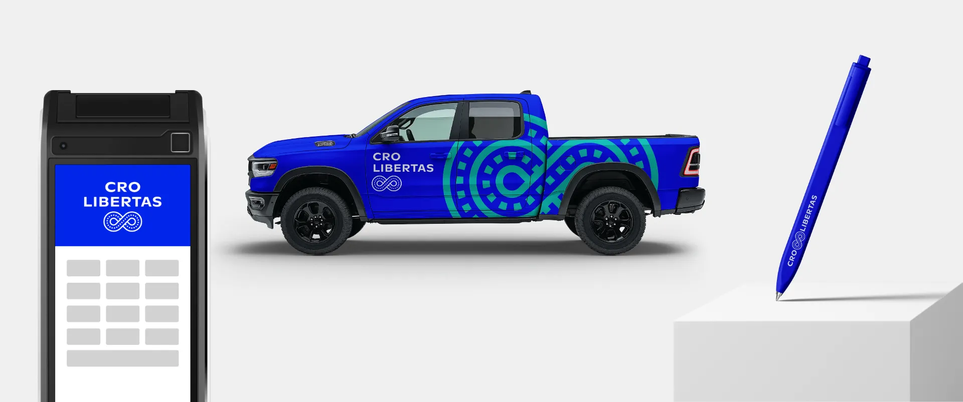
From a broader perspective, the symbol is connected to Croatian national identity by discreetly evoking the pleter (Croatian interlace) as one of the elements of Croatia's national visual code. The circular forms visually invite the eye to move, they are soft and approachable, and additionally evoke wheels or steering wheels.
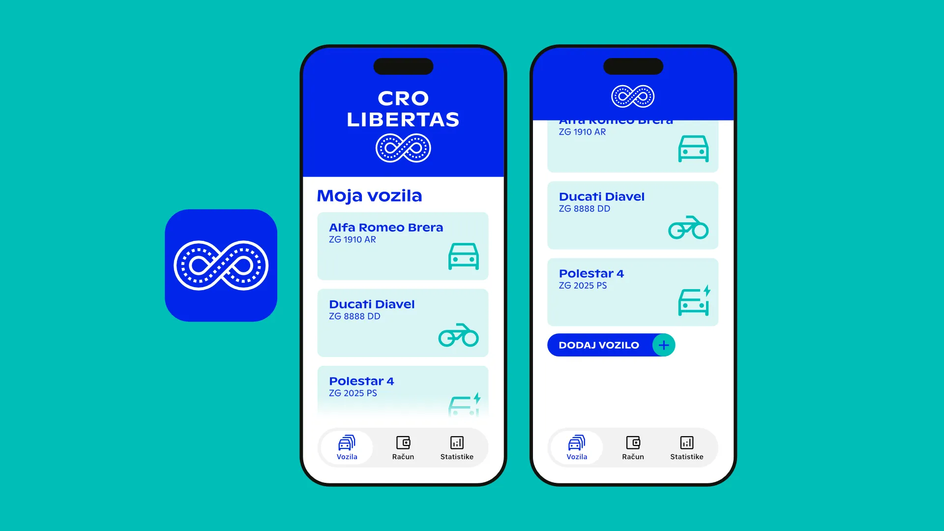
The CRO LIBERTAS logotype — legible and compact in form — supports the mark as the primary identity element. It can appear in several mutual relationships depending on the position and dimensions of the format itself, enabling flexibility in applications whilst maintaining simplicity and consistency of usage. The name is divided into two words for easier pronunciation and comprehension, as well as for the visually cleaner relationships this situation produces.
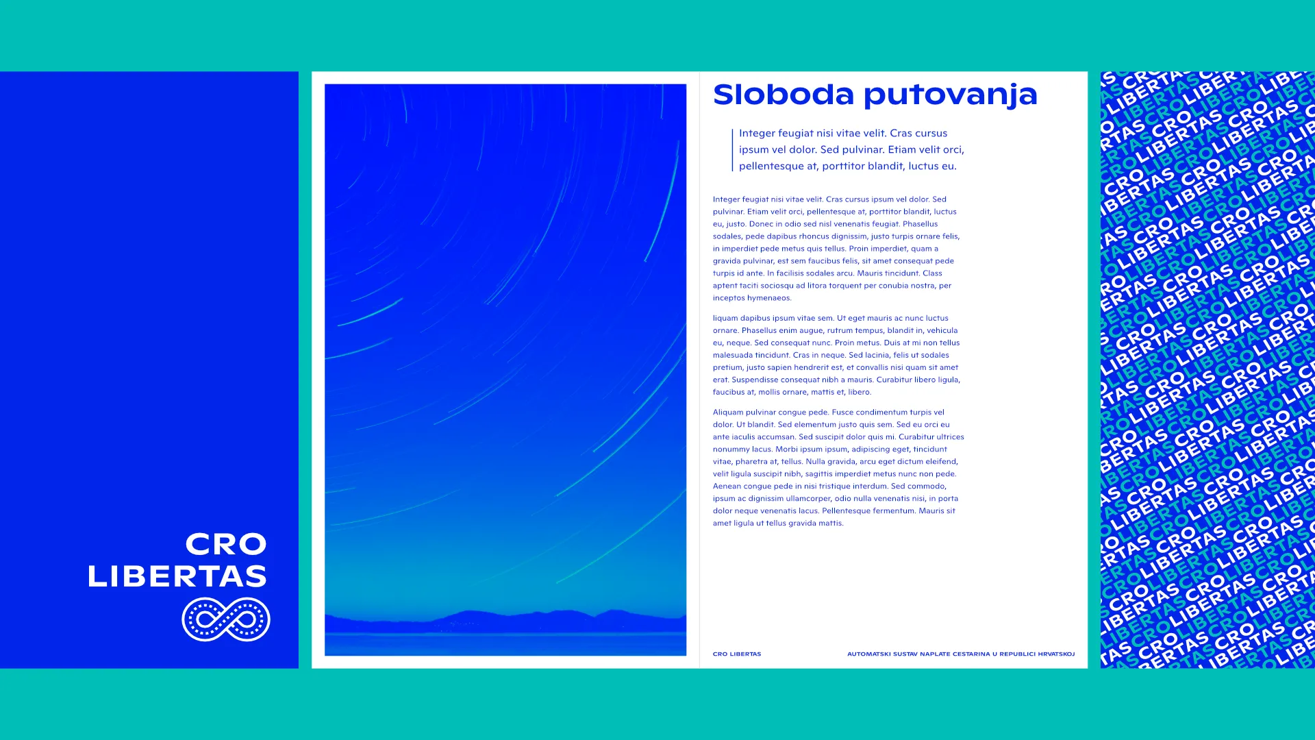
The proposed typefaces are geometric and humanist, thus visually corresponding to the form of the main symbol. The logotype's typeface is wide, open and approachable, exceptionally legible whilst simultaneously contemporary and with a sufficient degree of recognisable character.
Given that red, which is the primary colour of national visual communication, is neither appropriate for the project brief communicatively nor in the context of traffic, we selected blue as the dominant colour of the visual system. The secondary colour of national visual communication, blue communicates freedom and calm, infinite sky, deep sea—everything that can be associated with safe, free movement. The chosen tone of blue is vibrant and dynamic, thus conveying that this is a contemporary digital-first solution. The monochromatic mark in positive and negative can function equally well on signage with green, blue, yellow, or white backgrounds. In digital applications, the mark logically transforms into an application icon, and its form naturally invites animation.