Kunfini
Project info
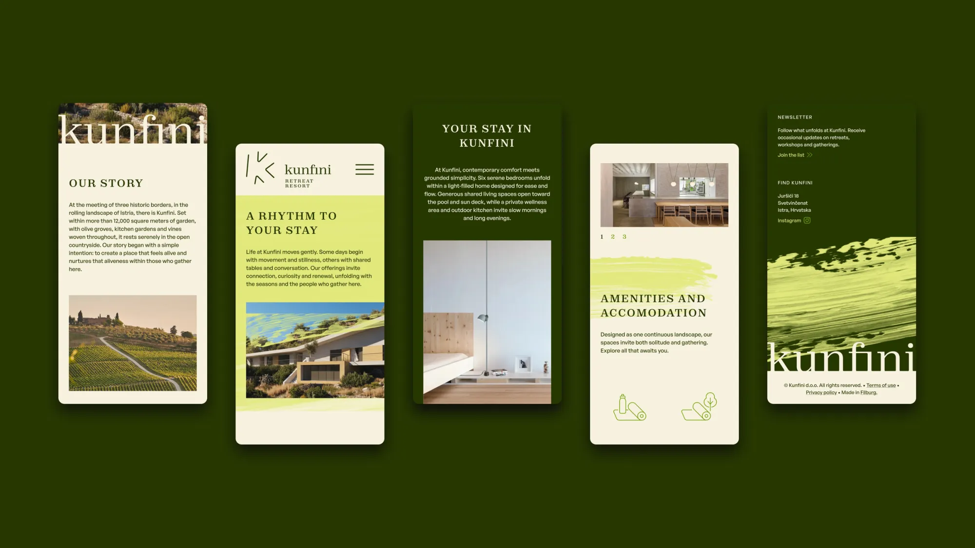
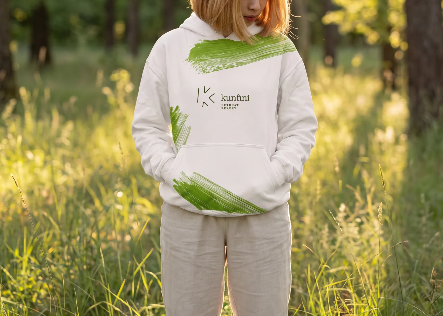
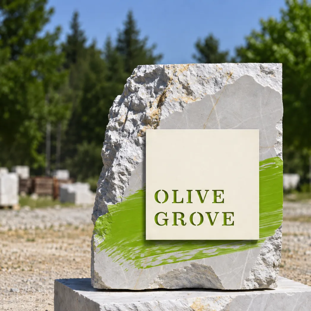
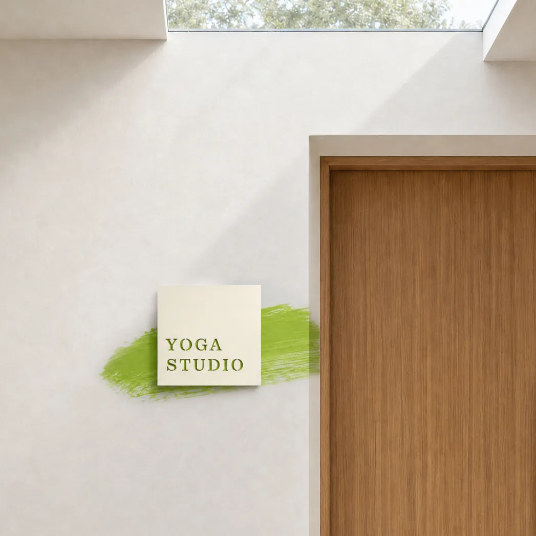
A unique resort covering more than 12,000 square metres, opening in Croatian Istria, required Filburg’s expertise in building an equally distinctive brand identity.
The main building houses refined accommodation, wellness facilities and a pool with a sun deck. A second building holds a restaurant, an exercise hall and a wine-tasting area. Around them, the grounds will grow into an orchard, vegetable gardens and olive groves, with walking paths for meditation and open-air spaces for yoga.
The resort is meant to host yoga seminars, detox programmes and healthy-cuisine retreats. Beyond that, it is envisaged as a meeting point, a setting where people come to slow down, reconnect and grow. Our task was to name the resort, breathe life into it with a visual identity, design signage across the venue, and design and build a digital presence, finding the right language to communicate with its target audiences.
Wellness is a crowded category. Many retreats talk about calm, balance and nature, and many end up looking and sounding the same. The challenge was to find an identity that belonged to this place and nowhere else. It had to be rooted in the Istrian landscape and its heritage, yet still speak to an international audience looking for something more meaningful than a spa weekend.
The name of the venue was already on the map. The site lies at the intersection of three roads, the same three borders that gave the nearby church its name. In the local Istrian dialect, kunfini means borders or boundaries.
That is how Kunfini Retreat Resort got its name. It honours the place’s history and dialect, and it carries a universal idea: the paths we choose, or do not choose, at life’s major crossroads. The name is short, distinctive and easy to remember, and it has a story worth telling.
A crossroads is one of the oldest symbols of choice. We all reach points in life where several paths open up at once: some we take, some we leave behind, and some we only notice much later. People rarely come to a retreat by accident. They come when they are at a crossroads of their own.
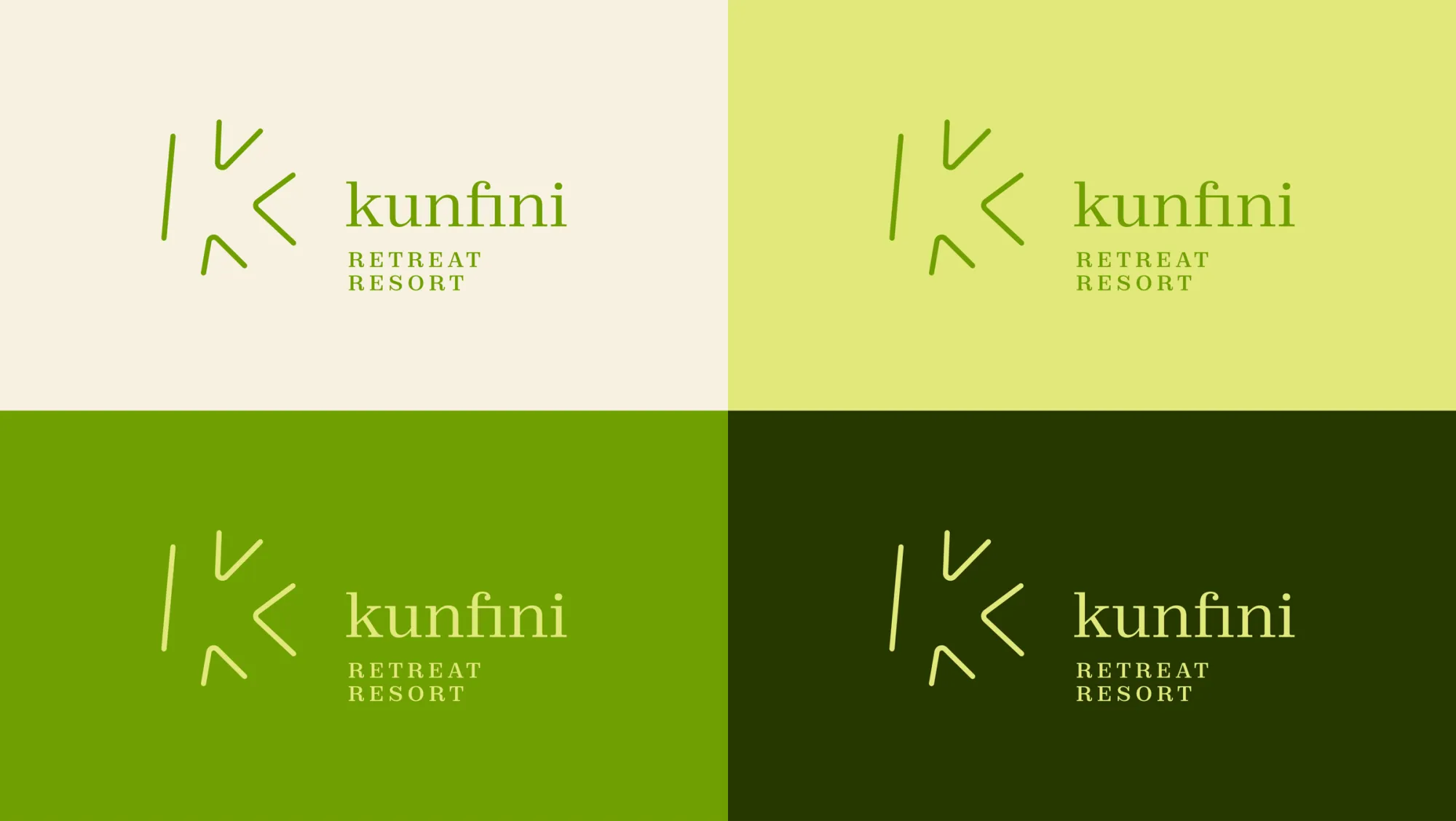
The visual identity grows out of the same idea. We built it around the motif of meeting paths and the quiet, natural character of the site. The aim was a system that feels calm and grounded without slipping into wellness clichés.
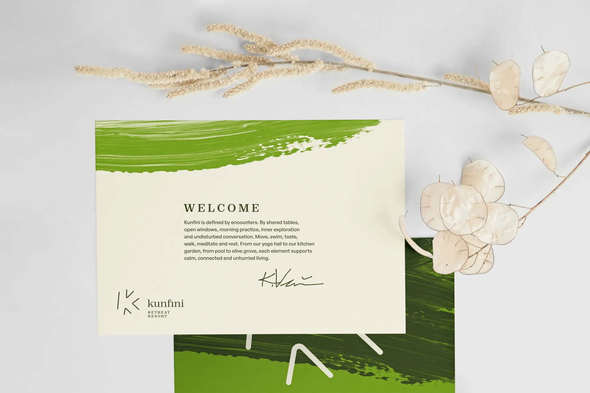
The result is an identity that is warm and human, with a clear sense of where it comes from, applied across all related visual communications.