University of Split
Project info


In a public tender for the new visual identity of the University of Split, Filburg's proposal came in 2nd. We proposed a concept that goes beyond the historical, cultural or geographical symbols in order to create as clear and strong a narrative as possible, at the same time universal and specific, and start building a unique educational brand.
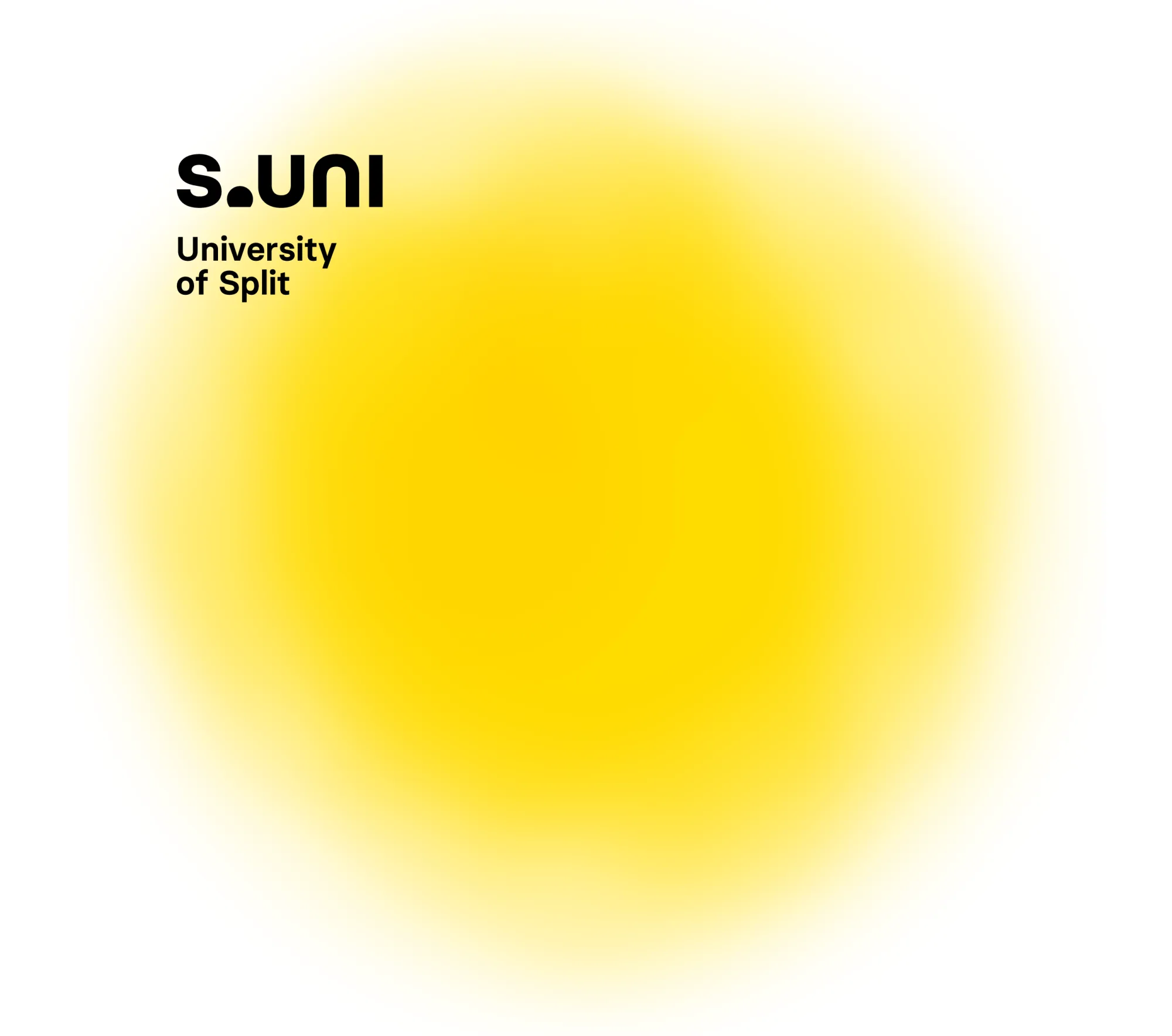
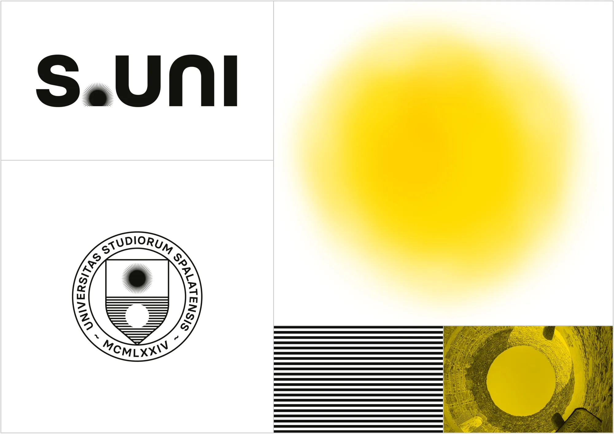
The main symbols of the concept are the sun as the symbol of the Mediterranean and light as the symbol of cognition and a future full of potential. Both of them are great communicators of a progressive and fresh university that students easily identify with, equally appropriate for a wider public to remember. A shortened S.UNI (Split University) points to and complements the concept, empowering it verbally. A small inversion of the bureaucratic UNIST gives it an evocative name and solves problems in verbal and written language.
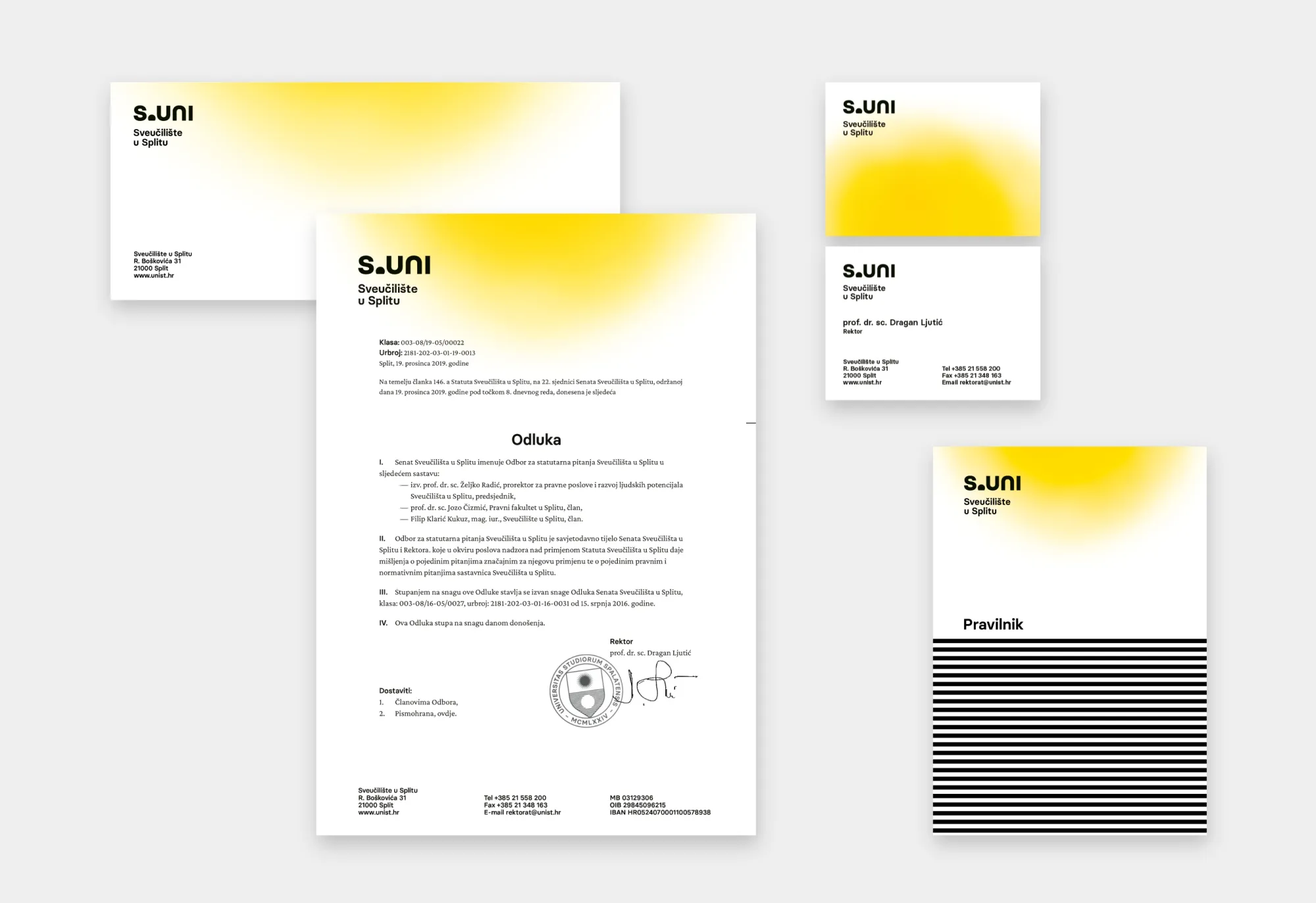
The visual system consists of a set of elements and modulates depending on the context of usage. The official, ceremonial and promotional applications are aligned with their audience and message.
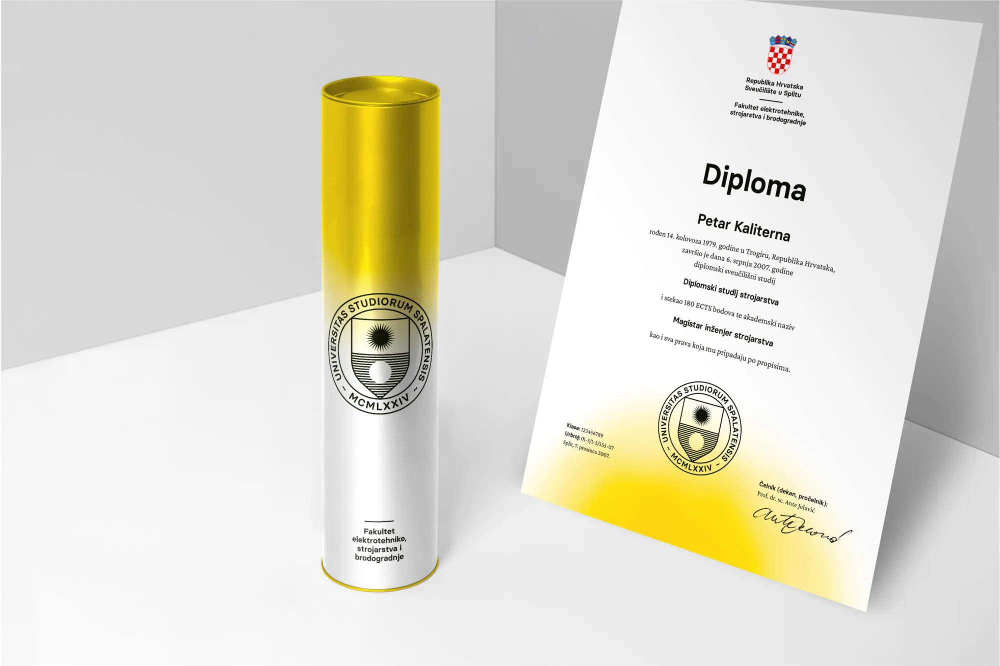
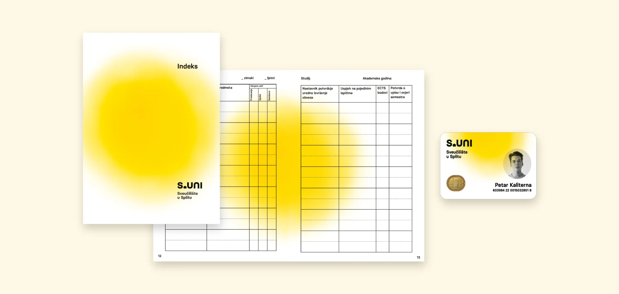
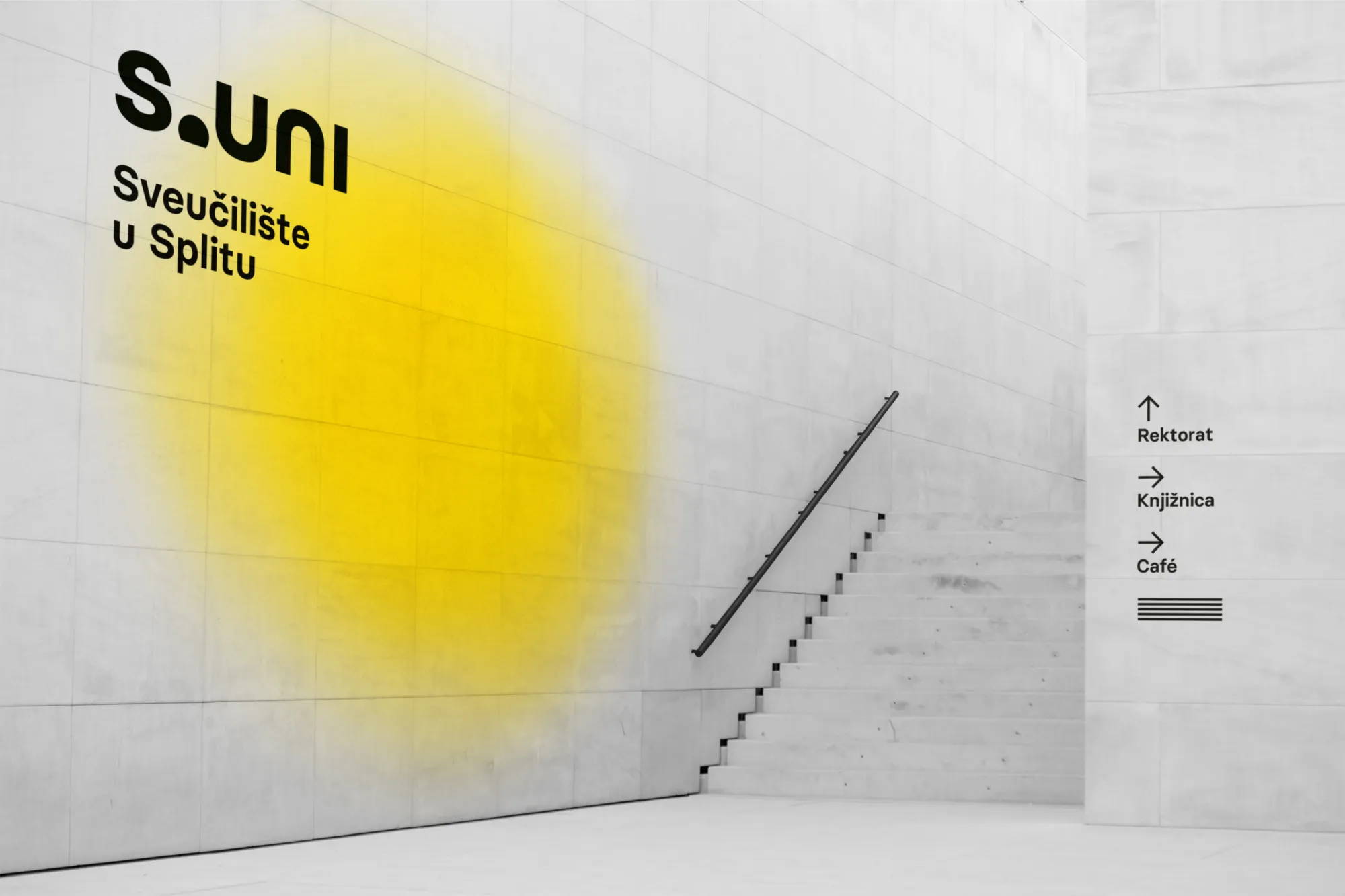
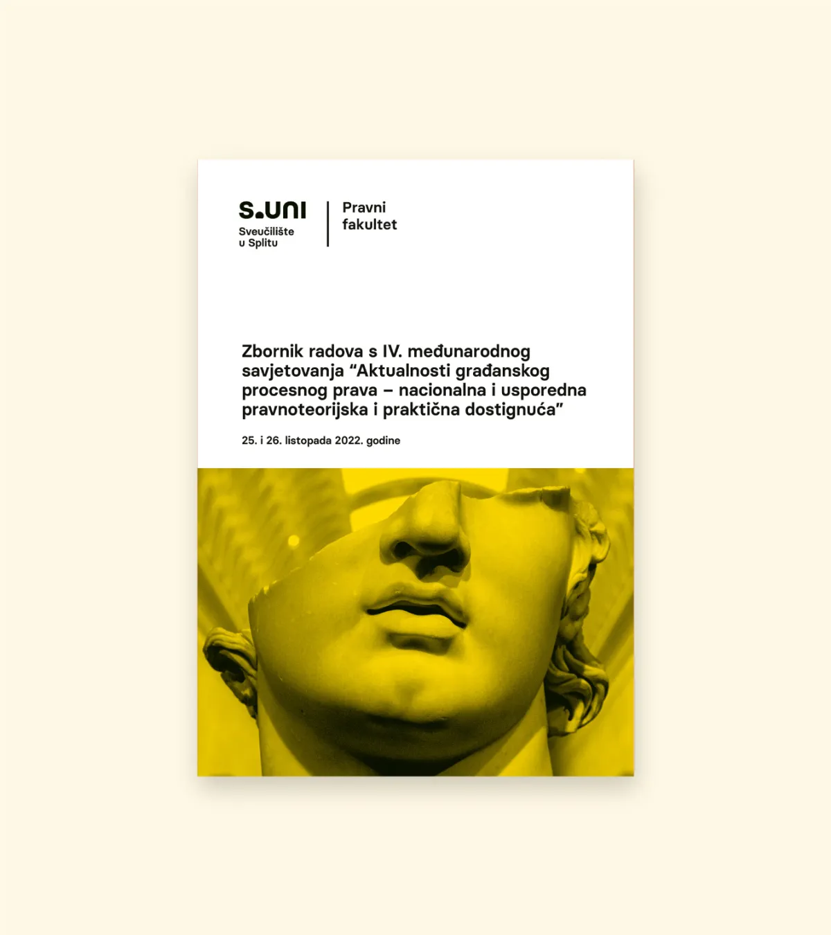
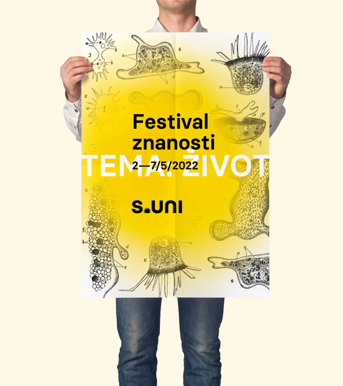
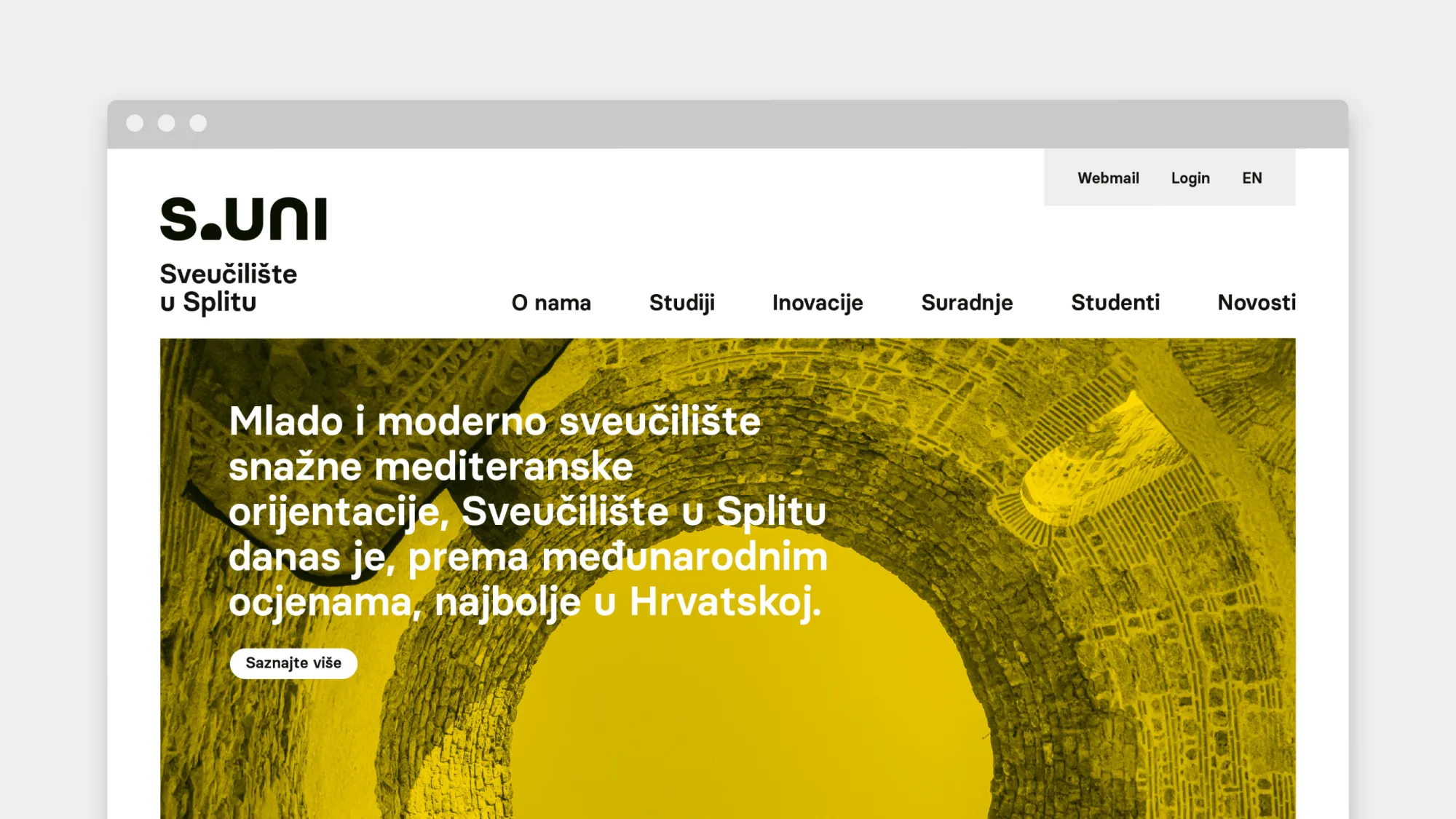
The illustration of the sun is the main secondary element of the system. With its recognizability, presence and warmth, it ensures an emotional connection with the observer but also serves as a visual anchor for compositions with other elements. Inside the format, it can move vertically, from sunrise to zenith.
Depending on the size of the logo, the number of rays in the sun is also customized. That way we ensure the legibility and the technical implementation in all media and sizes, while in large format applications, primarily promotional, the logo gains richness and texture.
The ceremonial stamp is an extended and more ornamental expression of the basic concept. This is where we introduce elements of reflection as a humanistic method and the horizon of the open sea as a symbol of open views as well as Split's architectural outlook.