
Despite user habits, should all websites look the same in order to be successful?
You visit a webshop wanting to find a specific product, automatically navigate towards the upper part of the site to enter its name, but the search bar is not there. Sounds familiar? Luckily, probably not nowadays.
User experience design on websites has always been followed by certain trends, as is the case in other creative industries, such as fashion or music. But in the case of websites in the past few years, the trends have, in a way, converged with the extremely developed “Internet science” – the so-called metrics. The Internet metrics can be perceived as the act of gathering information about users and their usage of, in this case, web sites; namely the number of users on the web, the numbers of users leaving the website after visiting the first page, the number of clicks on a certain part of the web site or the ad, the time and the way a web site is used and so on.
Best practices exist for a reason
People who are professionals in user experience and user interface design (UX and UI) base their decision about experience design on available metrics. And that is what’s partially responsible for the fact that websites are, to some extent, typical and uniformed. Regardless of whether it’s a webshop, portal or a presentational website, there are certain practices that have a proven success which are then replicated on millions of websites on the Internet.
The presentation of the most important content on the first screen, a practice that was taken from print newspapers where content is above the fold so it’s visible on the newsstands, was transformed into a so-called hero image. And that makes a lot of sense because a significant amount of users give up from surfing on the web pretty fast, already on the first page.
The practice of a clear call to action, through titles or call to action buttons also works well. People like to know what they need to do and approve of the positive and affirmative language which makes them feel good. Visual identities which include an alternative version of a logotype for smaller screens are also a good practice because big and complicated logotypes on a mobile phone take up the valuable space of a page. There are, of course, a lot of other examples of well thought out and established design principles that achieve good results on the web.
Where is the border between design principles and trends?
When we founded the hardware startup Loccie in 2010, we based our decisions about product development phases mainly on metrics. At HAX, the SOS Ventures accelerator in Shenzhen, metrics were something largely insisted on. (After the accelerator participation, we did our presentation in San Francisco, first in a pumped-up Autodesk HQ and after that at Dave McClure’s 500 Startups.)
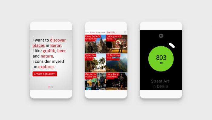
Loccie was a navigator and a kind of a compass that would take you to your wanted location using an iPhone app or, if you don’t have an Internet connection, a hardware addition in the form of a Loccie Walkie, a dedicated GPS device.
Besides that, every conversation with a potential investor would start with that topic. The startup movement propelled the Internet metrics because every decision being made about design looks informed and well thought out, instead of looking like a decision made by a playful creative, and all the investor decisions are justified with exact numbers.
However, the key mistake with Loccie’s product development wasn’t the wrong metrics (the so-called vanity metrics), but the too big of innovation in the product itself (which defined a whole new category), as well as a completely new interface. Only true adventurers wanted to use the application with navigation but no maps. The adventurers were great, as well as our primary audience, but for this kind of a product that wasn’t a big enough market. It’s interesting that the profession confirmed what the market didn’t and they awarded Loccie as an innovative project. It was awarded by the United Kingdom Sign Design Society as the best digital system for navigation in space.
It’s clear that the expected interface design can lead to an expected behavior that will make the user feel comfortable. Similarly, when a user takes a TV remote control in his hands, he knows how to use it no matter which brand it is. However, same as with designing other products, where is the border between using the best practices in a smart way to solve the problems of information organization, and trendy copying of the same forms which, at some point, become inappropriate and inauthentic?
I’m guilty, I admit…
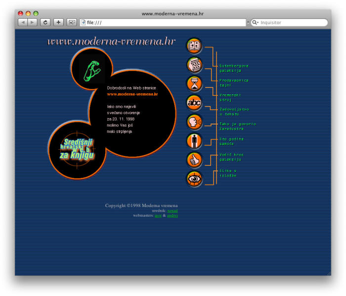
One of the first websites I designed back in 1998 was a cult Croatian online book shop Modern times (Moderna vremena). That was one of the most awarded websites at that time, and when I see it today, I am seriously thinking about changing my identity. The thing is, at that time the web as a media was a pretty new thing so there were no researched and best practices – everyone tried to make something different, interesting and new. Using technology at its beginnings, tables instead of CSS, small screens, slow modems, without smartphones and tablets – surfing the web, as well as its design, were a true adventure.
A few years later, in 2002, we launched an online shop for ShoeBeDo which had an integrated 3D product overview. We took a photo of each and every single shoe from an X amount of angles using the first bad digital camera, we even had a specially constructed stand made where we could rotate them. The analytics at that time were practically nonexistent, it was taken into account seriously just after Google Analytics was introduced.
Looking at this from today’s perspective, the question is how successful were these solutions in a measurable sense. On the other hand, people loved them, and combined with the rest of the communication which we did in stores and in the print, those websites brought a certain status of recognizability, maybe even a legendary one. They created a memorable and different kind of experience.

But fifteen years later, when the Australian Spare Workspace (a platform for renting workspaces) approached us because they wanted a redesign, we based it on tested principles, patterns and elements, which consequently brought great business results. In this case (and in many others according to our experience), playing by the book was the right move.
How did we end up here?
In the beginning, all the websites were more or less the same: textual – because the content was, justifiably, the point and the technology of designing that content was at its beginnings. After that, a roller coaster of design started: at one point everything looked the same and awful, when Flash appeared everything was notoriously different, and after the technology and the knowledge about UX developed everything was the same again (but this time based on arguments). Today when Javascript became the new Flash, and projects are being shared on social networks at the speed of light, every site is “different” in the same way. Lately, the attention is deservedly returning to the primary importance of content and the focus on the wanted outcome when visiting a website.
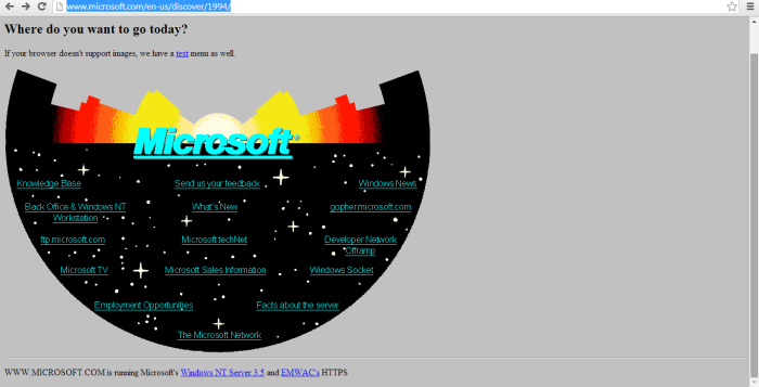
Microsoft’s first website.
WordPress and its themes, which drive more than 42% of all the websites in the world, played a big role in standardizing the design of well-known website elements or its UX. Secondly, when you ask a designer nowadays where he gets the “inspiration” from that often means “where do you steal your designs from”. The proliferation of websites and platforms which present “inspirational” examples has grown to the extent that trends are obviously expanding very fast with no understanding and applied logic.
The development of design systems, atomic design or similar principles in which the elements of a digital product are standardized to the max and repeatedly used, is definitely in accordance with the nature of the media. That’s great for designers and programmers because it enables systematic and fast development. It’s also good for users because those products are easily understandable, but potentially bad for creative outbreaks which would necessarily have to happen at the edge of the system, intentionally experimenting with the rules of that system we designed ourselves.
Design as behaviour
At its core, a digital product is like a machine. The UX is a blueprint of that machine, a design of its behavior, and not, as it seems, the answer to a question of how that “machine” actually works. The behavior then definitely determines the look. Alongside that, the design and development of digital products is a very complex process and is often not easy to control all the connected wheels, which means sometimes that machine develops its own character which wasn’t intentionally given by us.
People often mix up graphic design with what the essence of a digital product design is, meaning the act of designing the way it’s behaving and can be used.
Things are to some extent different depending on the type of digital product. Designing a presentational (image) website is surely different from designing a web application or a shop. Designing with a goal of making an impression is one thing, and designing for conversions is another thing, but both should lead the user towards the desired outcome when visiting a website, whether it’s an emotion and an urge to share the content or a click to the process of buying.
Innovate then measure
Steve Jobs famously said: “Some people say, ‘Give the customers what they want.’ But that’s not my approach. Our job is to figure out what they’re going to want before they do. I think Henry Ford once said, ‘If I’d asked customers what they wanted, they would have told me, ‘A faster horse!’ People don’t know what they want until you show it to them.”
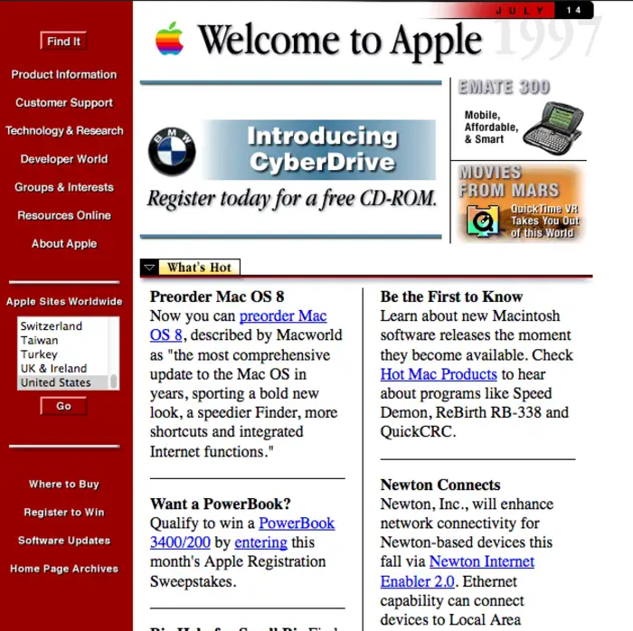
Not the oldest archive, but at least it has photos. An extract from Apple’s website from 1997 is symbolic also because that was the year when Apple almost went bankrupt, and Jobs made Microsoft Office available on Mac.
If we ask the right questions, the metrics can give us very exact answers. With their behavior on a website, the users are actually sending us clear signals about what functions and what doesn’t, how they see our content and ideas, what made them interested, where they get lost and quit. When we incorporate such an iterative and communicative way of thinking in the design process, the end result will surely be better for our business or organization.
So, where is the space for innovation? In my opinion, the patterns that are proven to work and UX/UI design innovation are not mutually exclusive. Maybe we should at least sometimes innovate first, and then measure, instead of just measuring in order to simply evolve. It’s just that innovation should be done gradually, use it to upgrade something that people already know and constantly iterate. Everything is possible in a digital world, but if an interface deviates too far from people’s expectations based on a physical world, the users become insecure, confused and unhappy. And we all, of course, want to repeat the experiences that make us feel safe, pleasant and happy.
