
2020 – the era of new stories
2020 marked the end of one and a beginning of another era. As the year of changes for many it meant a big crisis but also a big opportunity.
CLIENT
Motivated by this line of thinking, the agile team from 2020, a newly established content agency, decided to start their own new story. Filburg was entrusted with designing the visual identity.
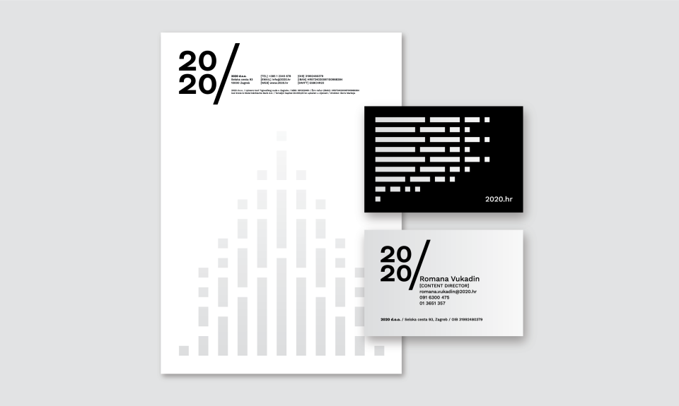
Slash as a mark strongly associated with internet content implies the continuing of the story or its origin. So to the right of the slash we create a space for new stories. The color palette is monochrome and dramatic, complementing the theme well and also leaving space for presenting the agency projects in front.
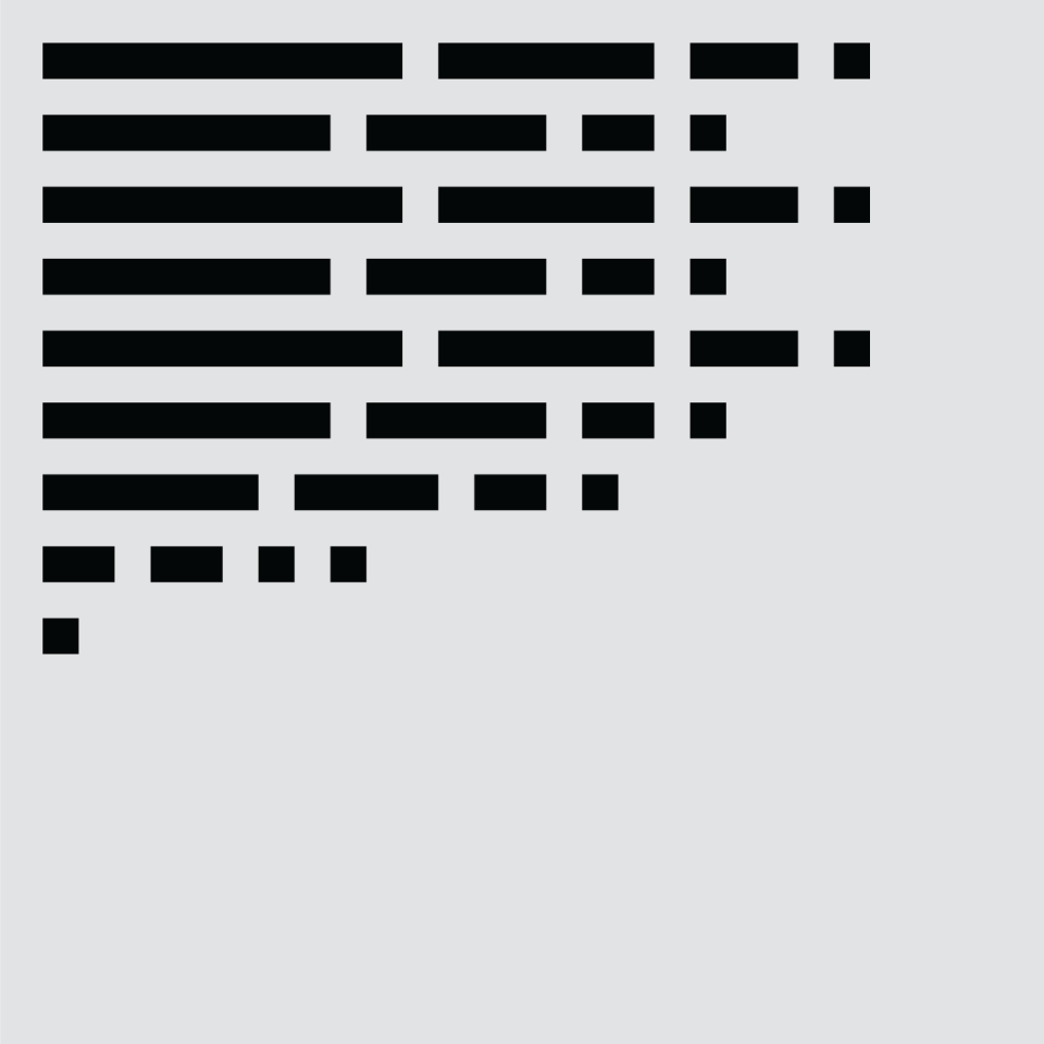
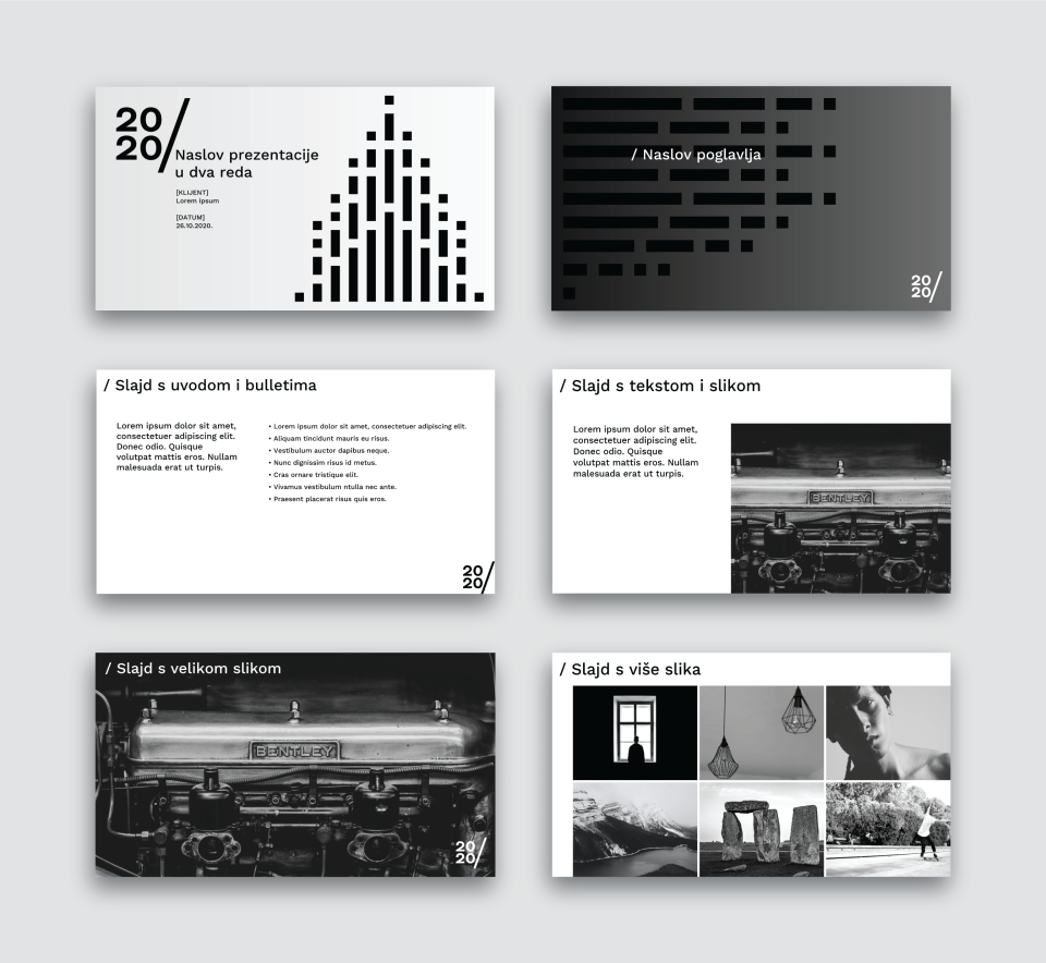
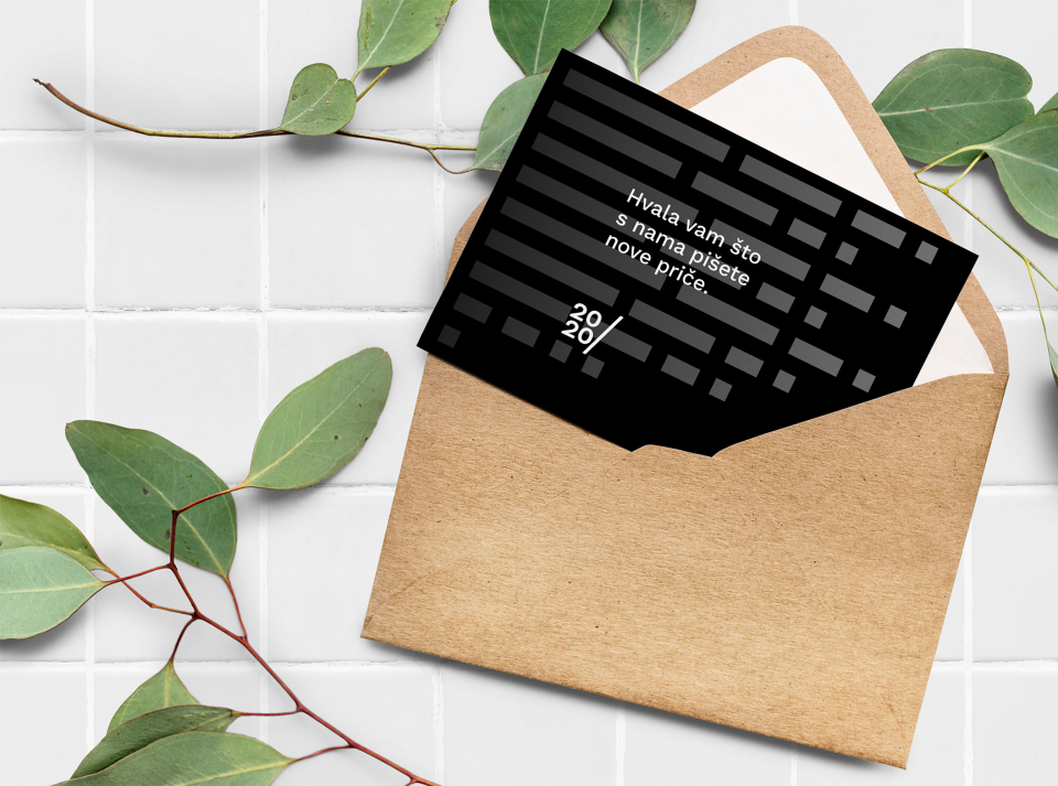
The symbol evoking lines of text transforms into a secondary illustration, in two variants: a vertical one symbolizing fire from which it was born and the horizontal one symbolizing a block of text (native content). The illustration can be used as a secondary element or as a background. In applications, all the elements are combined in such a way to make a recognizable but flexible system.
- Creative direction
- Copywriting
- Visual identity
- Graphic design

The visual system can be manifested in many different ways. Following are some examples of its applications.
Related projects

ZDL
Branding, identity, UX/UI
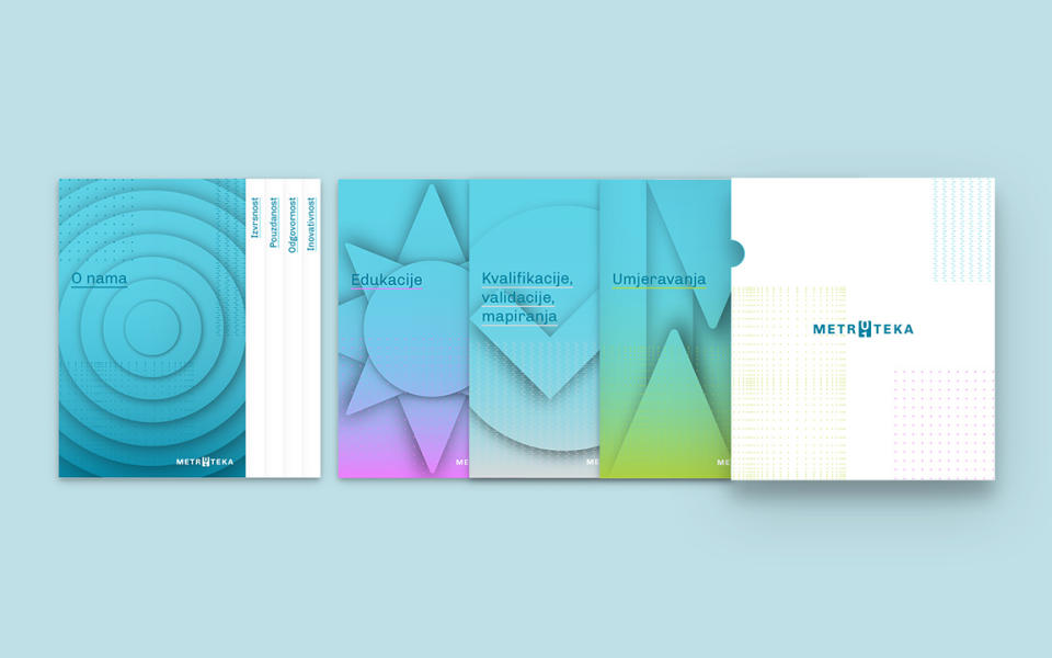
Metroteka
Branding and visual communications
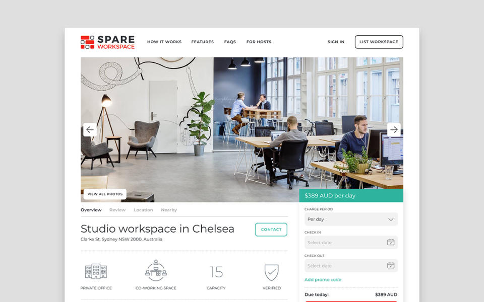
Spare Workspace
UI design and direction