
The Hvar House Company
Architecture and design complement each other as disciplines so it was logical for Filburg to be engaged as a designer of the visual identity of a real estate company focused on the Croatian island of Hvar.
CLIENT
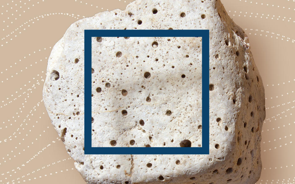
This real estate entrepreneur transforms traditional Dalmatian ruins into modern stone villas with rustic interior. As outlined by the official Croatian national strategy of sustainable tourism, the management of the company aspires to pursue renovation directed towards sustainable luxury. The target market is located in Western Europe while the profile of buyers revolves around speedy lifestyles interested in sustainability and refined taste for design and travel services.
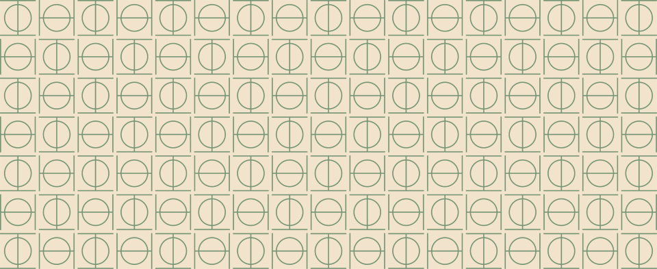
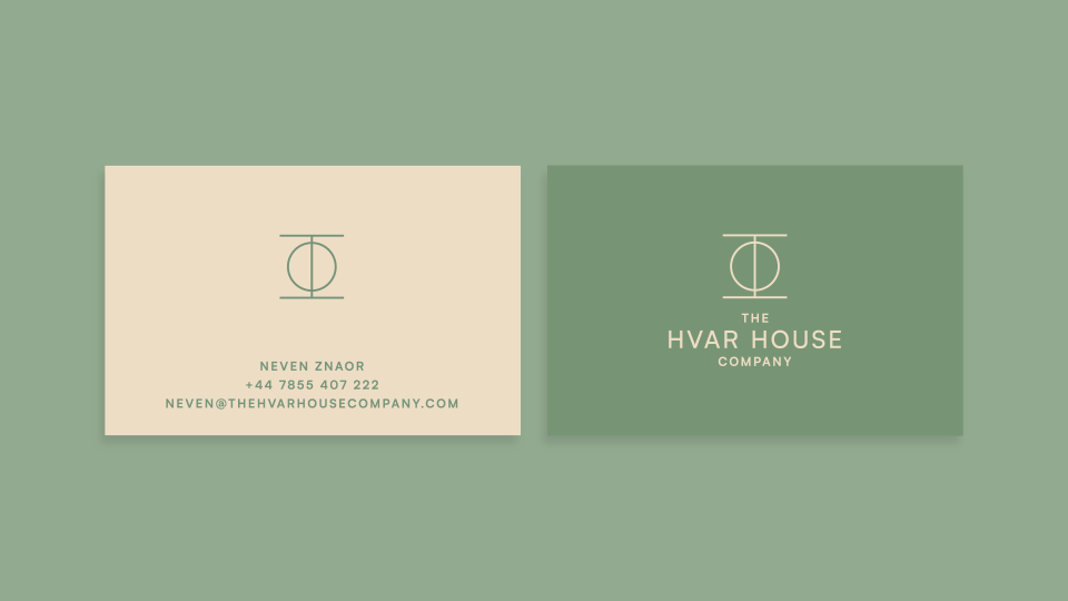
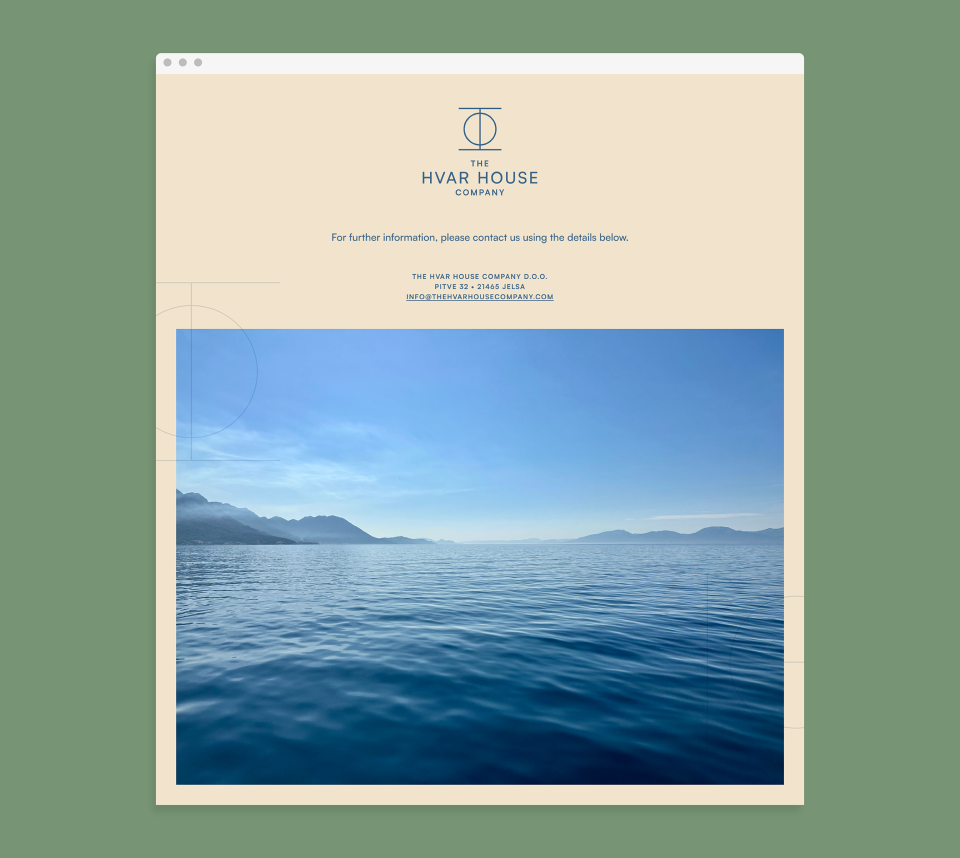
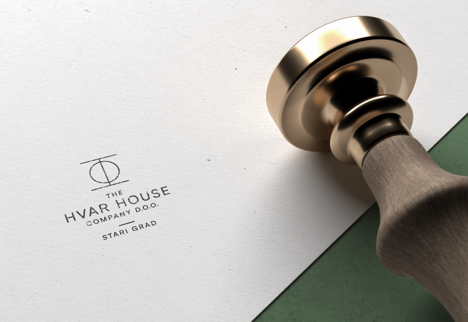
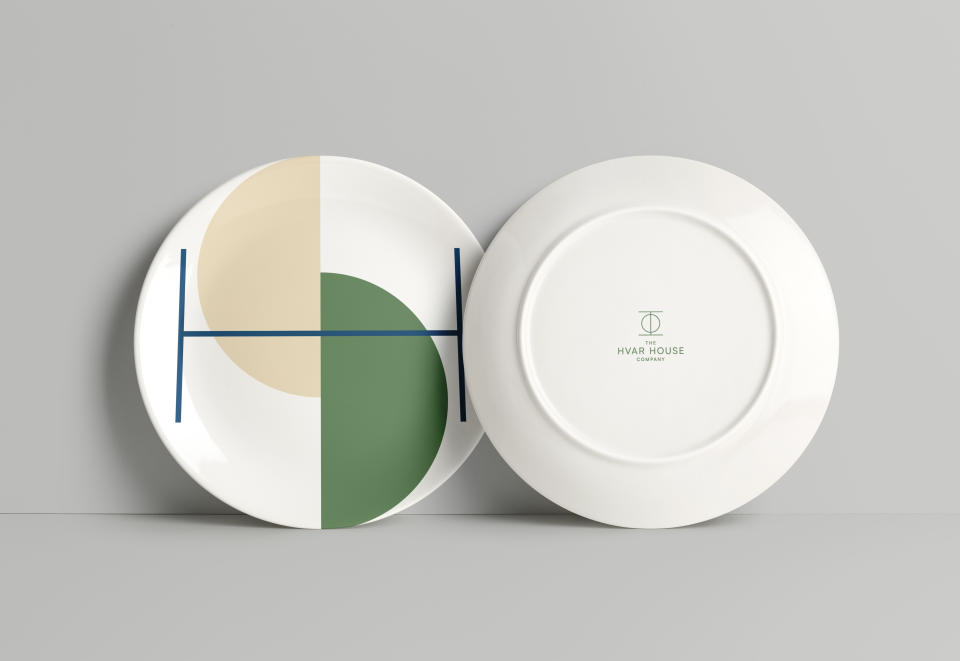
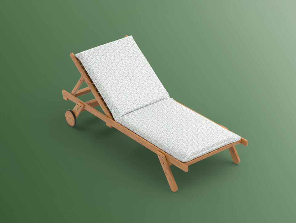
The visual identity is based on the Greek letter fi incorporated in the ancient Greek name for the island of Hvar (Φάρος – Faros). The symbol is outlined in lines and can be understood as the letter H, the central letter in the name of the company as well as name of the island. It functions as a pattern applicable to a plethora of interior elements and printed material.
The colours of identity have been deducted from natural phenomena found on the island — the sea, the flora, the stone.
- Creative direction
- Visual identity
- Graphic design
Related projects
Morpharos
Visual identity and communications

New Malinska waterfront
Visual identity
Ruđer Bošković Airport
Visual identity and communications