
Design in space – from signage to new experiences
Simultaneously with the galloping exodus of design-communication solutions to various screens which we carry and install everywhere, design in real world is rightfully experiencing a quality revaluation as a tool for functional understanding of spaces as well as for creating unique experiences in them. Environmental and Experiential Graphic Design (EGD) in a wider sense, alongside with its subdisciplines of signage and wayfinding (wayshowing) design, interpretation, and placemaking (branding in space) present exciting new possibilities of interlacing the subject itself (location, architectural complex, heritage etc.) with its story – be it from a historical point of view, certain phenomena or brand narrative.
Croatian conditions
In Croatia today these possibilities could and should be recognised as a great opportunity for augmenting the experiences of beautiful nature spots and material heritage as well as for raising the general level of visual communications in urban environments. Environmental and experiential design can be understood as additional layers in perception of certain spaces which, if well designed, result in high general visual culture, better tourist promotion, simpler using of spaces, more comfortable life.
It’s exactly this apparent dichotomy of functionality and narration which creates a special experience of visiting a space that often leads either to impractical systems or to systems which are not integrated in the environment and space heritage. Considering very specific principles for designing the environmental graphics it’s usually not the best idea to rigidly apply brand’s visual standards or design patterns from other media. Useful and interesting points in this line have been made by Nikola Radeljković on the example of recent integral redesign of Parks of Croatia.
In practice, design considerations are further complicated if the location in question is protected because the opinions of conservationists, natural and cultural heritage experts should be taken into account; the location has specific weather conditions (strong wind, fire hazard, salt and moisture exposure); signs are positioned next to roads, where safety comes first and legibility depends on speed; the space is used by visitors with special needs (disabled, blind or deaf) or behaviour patterns (children). Visitor profiling is especially important in each domain of user experience design, in digital media as well as real world environments, because it informs the articulation of possible and desired use scenarios for the outcome to be expected and easily reached, and the user experience immersive and inspiring.
From our experience
In the last four years, together with an excellent team of museologists, interpretive specialists, architects, programmers, and designers, we had a chance of working on a project of reviving twenty Frankopans’ castles and sacral objects, and their presentation in form of a cultural-tourist Routes of the Frankopans. This kind of an integral and complex cultural project is rarely done in Croatia — apart from renovation of the castles themselves and connecting twenty partnering locations in a single route with a strong and memorable story and interpretive plan, the project included the implementation of an entire visual system, from visual identity to setup of one visitor and eight interpretation centres, together with exhibition design, illustrations, design and production of multimedia and mobile applications, merchandise etc.
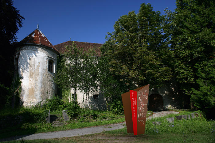
Interpretation totem on a location of the cultural-tourist Routes of the Frankopans
Last year of part of the task culminated in designing the signage and wayfinding system for all twenty locations along the route. The concept included road signage on regional and local roads; interpretive signage in form of a “pin” which marks arrival at destination, a totem which interprets the story of the location and orients the visitor, and “stones” which tell the story in the context of its surroundings; pedestrian signs for locations unreachable by car; and function signs to be implemented in the castles themselves. This complex system applied to various natural and historical locations from the island of Krk to the mountainous region of Gorski kotar presented itself with several key challenges.
One of them was how to unify and standardise different signage typologies well. For example, road signage is completely regulated by the law (Zakon o sigurnosti prometa na cestama) and two bylaws (Pravilnik o prometnim znakovima, signalizaciji i opremi na cestama and Pravilnik o turističkoj i ostaloj signalizaciji na cestama) while the road signage study has to be approved by the relevant road authorities before implementation. Colours, sizes and types of letters, icons, and illustrations are defined by the bylaws, unfortunately not in enough detail and quite unprofessionally — neither the colours are precisely specified nor are the typefaces and icons programme consolidated for download and usage. There is also no central database of all installed signs but the bylaws require new ones to be positioned in relation to them. In practice there is a certain free space for interpretation of regulations and suggestions regarding design and positioning of signs – it’s a miracle that the current road signs look relatively consistent. All this meant that we have had to take all those parameters in consideration in order to align with regulations and produce safe and functional signs while presenting the locations on the Route in a unified and recognisable way, both verbally and visually.
Function signs system for the cultural-tourist Routes of the Frankopans
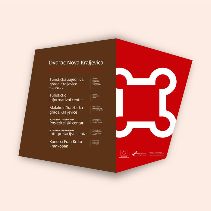
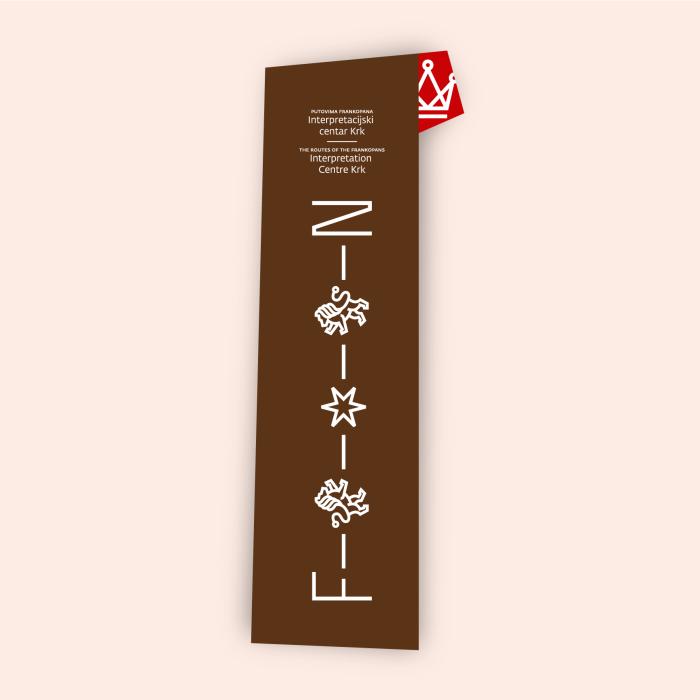
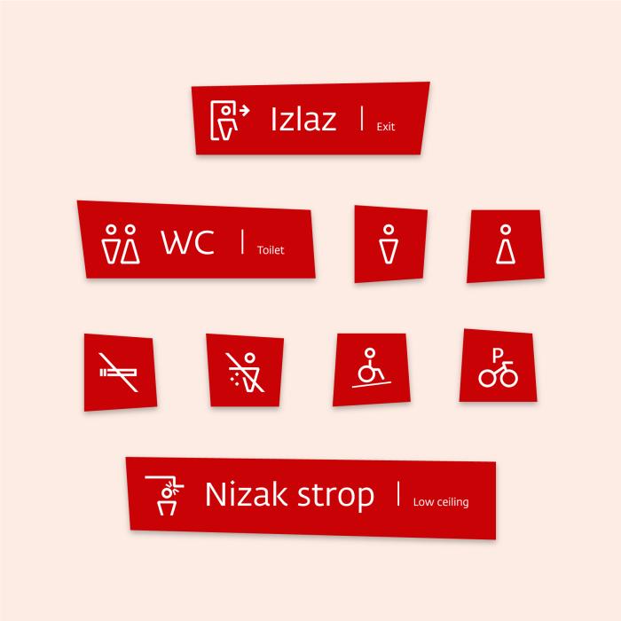
A project with so many partners also carries a challenge of aligning visions, existing initiatives, and already set up systems (e.g. pedestrian signs installed as part of some other routes or by other authorities). For interpretation and function signs, being close to the castles, we have closely cooperated with conservation experts to protect the integrity of heritage locations in regard to forms, dimensions, materials, colours, flooring, and archeological supervision, as well as with statics and production experts to ensure longevity, safety and resistance to strong wind characteristic for the region. Eventually, partly because of aforementioned factors and partly because of lack of historical material, we did not follow through with elaboration of “pin” and ”stone” typologies while the totems have been executed in two types, adjusted to specifics of each location. It’s important to say that the interpretive content for the totems has been created as complementary to the stories continued in the interpretation centres, in good part through multimedia.
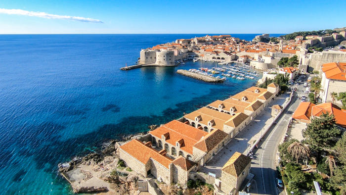
Lazareti in Dubrovnik
Lazareti in Dubrovnik, whose signage system we’re currently working on, are a historical complex par excellence. Apart from the heritage importance and specific architecture, there are also numerous stakeholders and subjects working within this future creative hub of Dubrovnik. Therefore signs have to be designed from the start in a dialogue with them and the cultural heritage conservation experts. An ideal situation in which Filburg as the author of Lazareti visual identity has a change to design this, possibly most tangible, manifestation of it, in practice means that the visual identity implementation has to be approached softly and flexibly, with maximum sensibility for the location, existing forms and materials, extending it with certain formal specifics (in this case stylised forms of Lazareti halls).
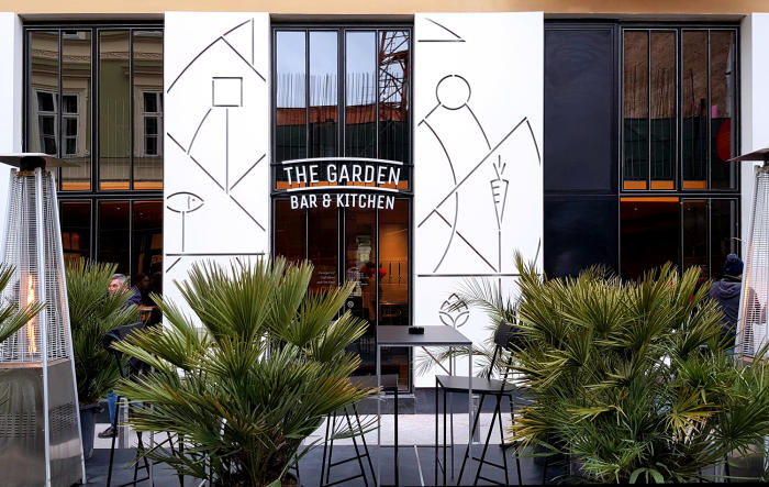
In simpler cases, such as our projects for ShoeBeDo, Blok bar or The Garden Bar & Kitchen, recently received the Special Jury Award at the global design competition Hiiibrand, where there aren’t so many logistics limitations nor complexity and variety within the system there is a lot of free space for pure branding in space — extending the brand narrative into public environment and creating a sign in space.
Street façade of The Garden Bar & Kitchen in Zagreb
Towards new orientation
In any case, design of environmental graphics and experiences is never a trivial task. It is certainly multidisciplinary and requires including a whole range of associates and experts, depending on the project – from urban planners and architects, through museologists and interpretive specialists, copywriters, illustrators, to product and graphic designers, conservation experts, statics and production specialists – but above all work together with the investors as partners. Concept, content, and story which is to be communicated should be given primacy, start with them and integrate all sign typologies through graphics and hardware choices. Sometimes such an approach brings forth a completely novel solution, transposed to new media, like our older experimental project Loccie, awarded by the UK Sign Design Society as The Best Digital Wayfinding Project, which opens the possibilities of changing scenarios, gamification, and interaction with the visitors. It is exactly this high-quality interaction which guarantees a memorable experience and facilitates orientation in space that every good environmental graphics design system aims for.
In Croatia at the moment there aren’t many good examples of this type of solutions in public spaces. The city of Zagreb has implemented a rather well designed system of marking streets and squares by excellent and renowned designers and typographers Nikola Đurek and Damir Bralić, but it’s negatively counterpointed by brown tourist signs of an unknown author. Private and commercial venues present designed systems more often but also not usually, like some business-living or hotel building complexes (Amarin Hotel in Rovinj, Ban Centre in Zagreb, and others). It’s a big opportunity to approach the projects of environmental and experiential graphic design as strategic ones, and by choosing qualified experts on tenders to implement design solutions which will elevate unique, beautiful locations which Croatia is full of, as well as everyday spaces, to a new level of usefulness and experiences for the inhabitants as well as the visitors.
